Matt Lichtenwalner

Mobile mapper for Ushr - roaming the US and Canada constantly. Maybe a bit of art and/or writing here and there to spice things up.

  • Followed
  • Follows you

Edit biography

Okay, I just need to squee for a minute.

Yup. Me. Squee.

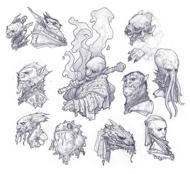
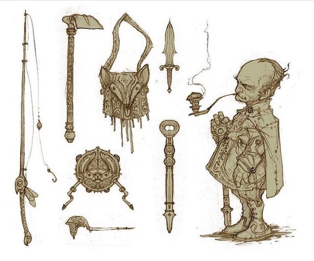
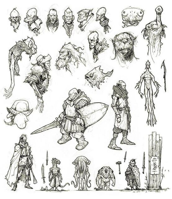
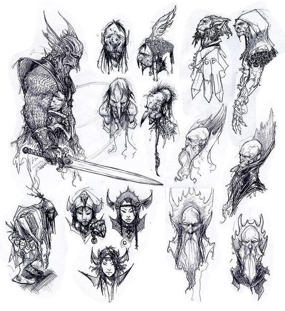
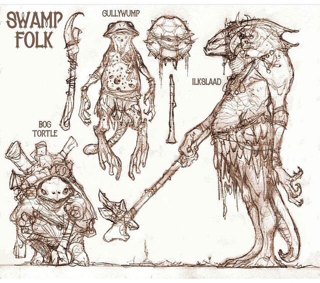
Not familiar with Richard Whitters' work? Allow me to illucidate:

And on top of all that? I've been following his Twitter account for some time now and he just seems like a genuinely nice guy.

So now, if you'll excuse me, I'm going to go draw until my brain leaks out of my fingertips.

MORE
12/13 '21 4 Comments
 

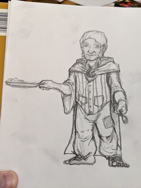
Did some sketching in a physical sketchbook for the first time in a bajillion years. This one is of a fairly traditional halfling, hairfoot, or 'hobbit' (if you're not concerned with copyright). I did this one for comparison and as the 'default' for people to reference. 

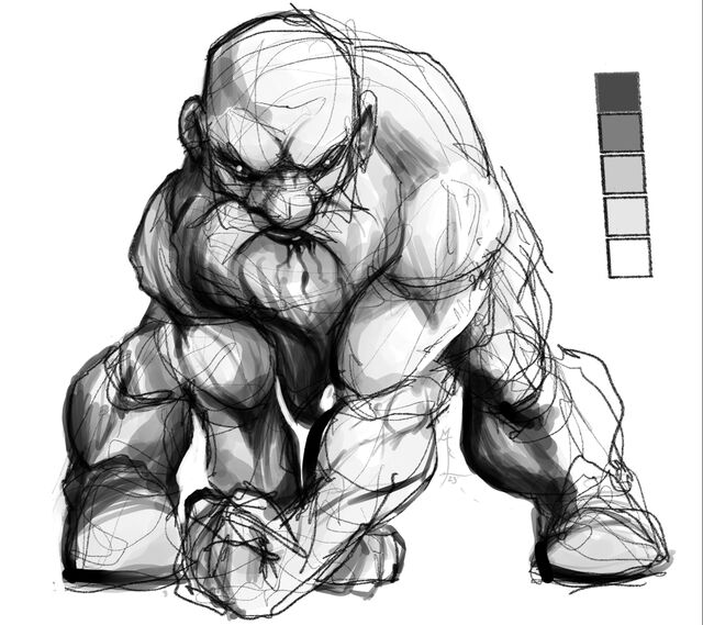
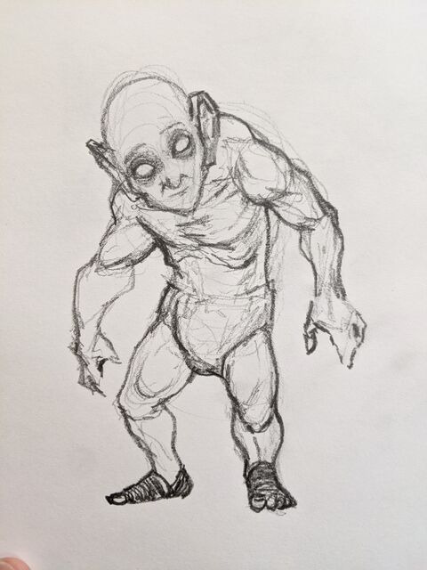
Then, next, I did a rough concept sketch of a sub race that my buddy Brad and I are working on that we are tentatively calling 'dustlings'.

It took me wayyy too long to realize that I'd recreated a jacked version of Smeagol / Golum from the Hobbit / LOTR.

Back to the (literal) drawing board. 

MORE
6/2 '21 8 Comments
I dunno, it's okay? Gollum's a scrawny, craven little thief. Your guys look like they work for a living. Less agrarian, more hunter/gatherer kinda thing.
Thanks! I did some more putzing around and come up with something I'm at least a _little_ more satisfied with.

Still, glad to know this very was functional. :)
Swole-um
Yeah. Didn't mean to take it that far, but sometimes I get carried away. That's what I get for learning to draw by looking at superhero comics for decades. :P
YAY FOR PHYSICAL MEDIA!!!
Yeah. I imagine it really IS a little like if I was to get on a bicycle right about now...
"Art is theft."
 

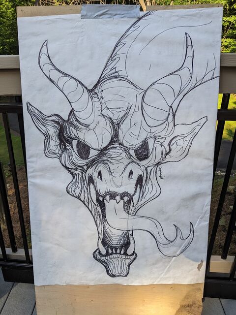
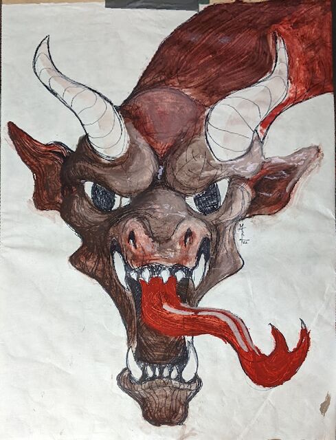
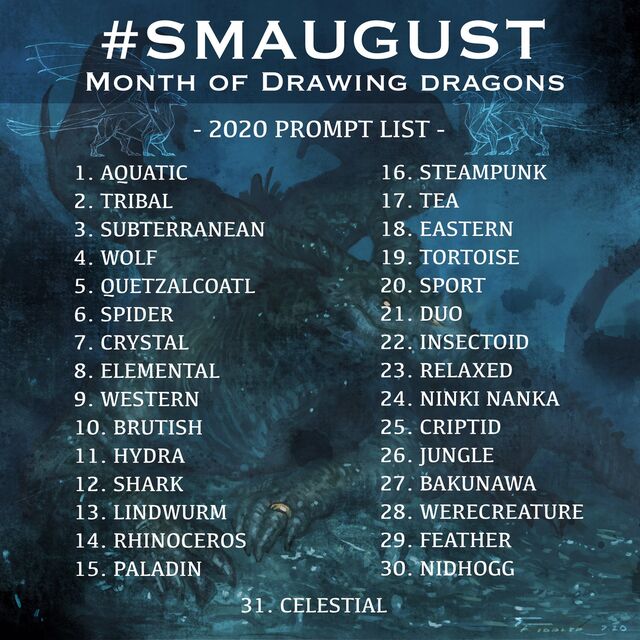
Some of you may be familiar with Inktober - where there's a list of art prompts for the month of October and the challenge is to create art every day from those prompts in ink. I've done it a few times and 'won' (succeeded) once.

Now I'm doing Smaugust. It appears to be far less popular, but given that I'm the owner of dragonbones.net, I figured I would give it a go. Of course, I have a bunch of other stuff on my plate, and shouldn't really be spending my limited time on a meme, but what the hell. I have an idea that might make it worthwhile (beyond the pleasure of doing it / the experience of 'stretching' a bit).

Anyway, I may a post thread over on Twitter where I'll be posting them every day. I'll probably do actual posts with info on how I made the different illustrations etc on my Patreon page and/or dragonbones.net. That said, I figured I would put the first few up here for you to get a feel for the challenge and what I'm currently doing with it.

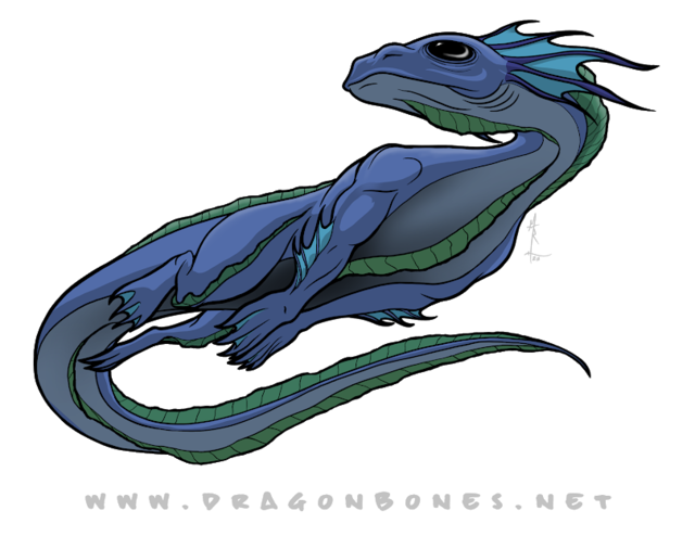
Day 1 - the Aquatic Dragon

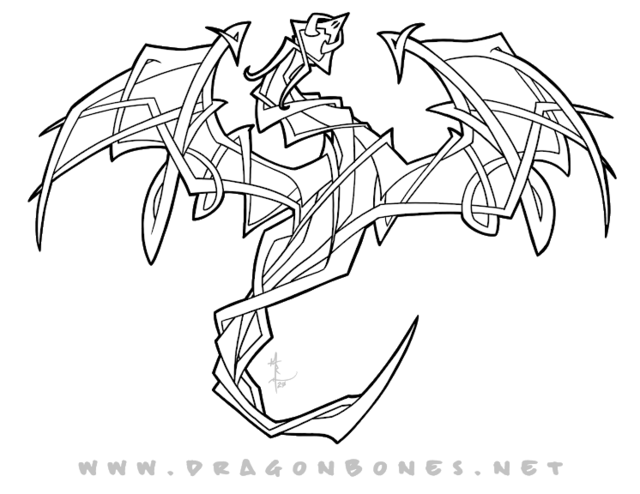
Day 2 - the Tribal Dragon

I may re-do this one later. I'm thinking about creating an ebook after the month is completed with a write up for each of the dragons to be used in TTRPGs, but this wouldn't make for a good creature as is. Of course, maybe it will be a magic tattoo or something... I guess time will tell.

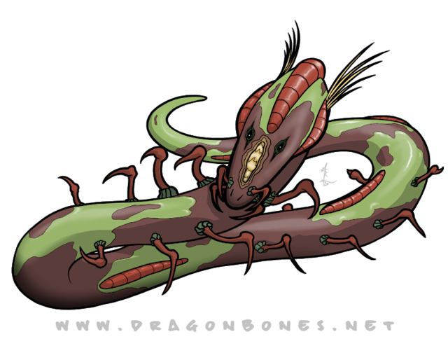
Day 3 - the Subterranean Dragon

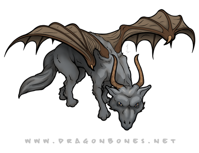
Day 4 - the Wolf Dragon

I went a little 'on the nose' with this one, but I just kinda wanted to.

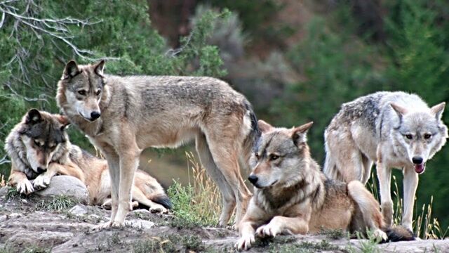
I used the guy all the way on the right for reference from this pic. Obviously, I stretched him out and didn't stick with it very much. Perhaps it's better to say I used him as a starting point.

MORE
8/4 '20 5 Comments
OMG OMG OMG!!! Eeeee!!!! I want to see the tribal dragon colored, or more of the tribal markings in black. I love the Wolf dragon.
Beeble will like this meme a LOT!
I'm already super behind (of course). More soon!
I love the aquatic dragon!
Awww - thanks! I'm already looking at each of these and seeing nothing but the flaws.

It really doesn't take long, dammit.
Don't think like that. Move on to the next day's drawing, and then go back and revise.
 

Been a while since I did any Patch images, and I got the proverbial itch tonight, so...

MORE
6/25 '20 5 Comments
That came out well!
I love his facial expression.
The shadows on #3 are a little stripy, not sure where the light source is, but the image itself is ... alive and predatory and amused. Reminds me of the t-shirt Houser has that says something about being excited for the zombie apocalypse.
The real take-away for the lighting is that it isn't clear, but just so you have the info, my INTENT was for two light sources: Moonlight or electric (blue) light that is subtle / gentle from behind (to our right) and above and a white light almost directly above (I was thinking 'streetlight').

I'm trying to play around with multiple light sources to add to realism. Honestly, this may be a bit of a mistake since I don't have a really 'realism' style. I'm far too cartoony, generally speaking.

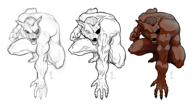
I'm glad his facial expression seems a bit nuanced. Something that... irks me about a lot of wolf / werewolf artwork is that there is zero nuance. Perhaps that makes sense given the subject matter, but I'm a fan of subtle. More than binary seems a good thing. Real wolves aren't either A: I love you or B: I'm eating your face, so I figure werewolves could have additional complexity too.

And thanks!
Sometimes that's A and B. :)
Any time spent drawing is a good time. :)
It's really true. And I have to admit - there's additional comfort with this guy. Like comfort food, or reality tv or... whatever. A little bit of 'coming home'.
 

Today, while driving, I was listening to The Creative Penn podcast. She was talking at one point about how it's better as an entreprenuer to have an online business right now because people can still purchase your books, and that will help you stay afloat in the hard(er financially, at least) to come.

My mind wandered as it pretty much always does. That brought me to the simple idea that art, in all its various forms, are luxuries. They're not absolutely necessary for us to exist. Yes, I know. I, too, feel like it's pretty much life's blood, but logically, it's not.

That, in turn, made me think about the fact that many (most?) folks will have to cut back dramatically on their purchasing of any form of art in the near future. I myself was thinking about how I need to go on a 'financial diet', and get rid of a bunch of recurring payment stuff that I simply don't need.

But here's the thing - if we assume that TomTom isn't going to be forced to take us off the road, AND that I'll continue to be employed there for the forseeable future and of course that I don't get sick, I'm going to be okay. I still have a job. Art doesn't pay my bills. This is probably the first time in my life I'm thankful for that, even if only marginally.

All of which brought me around to "But what about those who aren't in my situation?"

I got really upset at that thought.

There are just so many people who are going to be struggling. And the artists out there who have been scraping by with the income from their art? Forgoing the 'niceties' of things like health coverage because they would rather be creating than healthy? Or maybe a step up from that - those who were able to get by, but certainly couldn't put even a penny away for a rainy day?

Ouch.

I know that there's talk of governmental help. I know that creatives aren't the only folks who will be hurting. But I just felt like... I dunno. I guess I just want to do something to help.

I have no idea what that is / should be.

Any thoughts?

MORE
3/27 '20 2 Comments
I have similar thoughts, and then I want to read up on the Federal Art Project, and why it worked or didn't. https://www.theartstory.org/definition/federal-art-project-of-the-works-progress-administration/
Bookmarking for later consumption. Thanks for the heads up.


The folks at gmbinder.com are kinda brilliant. They've built a website that makes it easy for any old schmo like me build a PDF with all the formatting of a Wizards of the Coast Official 5e Dungeons & Dragons manual.

You enter simple markdown into one window, the website interperets the markdown, and uses CSS to spit the content back out in a second window with all the formatting done for you. No need to learn about different fonts or spacing or... whatever.

I've seen a couple different incarnations of this kind of thing, but GMBinder seems to be the best of them - at least that I've been able to find. And it's 100% free - at least currently.

So when I first came across one of their competitors, the idea occured to me: "This would be a great way to promote dragonbones.net and my illustration services. I'll make a short "D&D Book" that is filled with my art and talks about how to hire me to create the art for your D&D book!" It's kinda meta, and I think folks would like that. I've never heard of it being done before, and the name of the game when selling anything is 'stand out from the crowd'. So if I do this right, I can stand out from the crowd while demonstrating just how perfectly I fit in with the crowd.

Oh shut it, Westley - it makes sense to me, and that's what matters.

Anyway - if any of you would like to have a look, you can find it here.

The cover is just a rough sketch, but all the art in it is my work, and I'm already working on a revision which will expand the book, provide more samples, etc. But with that said, I would love any and all criticisms / feedback / reviews / etc. Please - beat it up. :)

MORE
1/21 '20 6 Comments
Very nice! As a remarkably minor quibble, would it look nicer or read easier if each tier was on its own page? More room for extra art, unless there's some reason to limit the page count.
I'm struggling with that a little myself. I definitely feel like there needs to be more in the way of samples, but I don't want to load it so full that it loses its "This is a real WoC document!" feel. I've been working on a revision that includes more sections (what to expect from me, how I work, etc) and those will all have more art and then if I'm not satisfied there's enough, I would probably just create several pages at the end of the document that would be exclusively a gallery of sorts.

But to your question - I can't think of any real reason to limit page count aside from my desire to keep the file size reasonable so I can email it to folks.

I'll post future versions so you can see what I've done. I DO like the idea of keeping each tier on their own page if I can do it... properly. :)

Also - a heartfelt thank you for the feedback!
Do you need one document that explains all of this minutia? Part of me is like TL;DR. I'd love to see a "short and sweet" one page slick, and then if they want more, give them something like this that explains the whole process and the benefits and what-kind-of-client-are-you.

Run this past Jerm-- he makes this stuff for a living.

(With that, I know DnD people are a different breed, a breed who still actually *reads.* But sometimes a one-pager with a stripped-down image for cheap, a more detailed one for less-cheap, and a fully-realized beautiful image for spendy hits you harder. Their eye will be drawn to the fully-realized one right away because it's the purtiest. But in the thing you have here, people don't see your best work until they're a few pages deep... and who's to say they'll get that far?

Also, I love you dearly, but that front-page image isn't pulling me in. I see what you're trying to do, but I think you put your most gorgeous work on the front cover... and maybe put thumbnails of the same image at different pricepoints/detail levels around it so they can see the options you offer.

Just a scream of consciousness reply here... sorry if I'm not totally clear.
As usual, I feel like you're spot on. This is... call it an alpha version of the final document. I was thinking that I need a "tl;dr" page as Page 1. then people can proceed if the want to.

That said, I DO want to explain the minutia. For a number of reasons, not the least of which is the fact that people ALL perceive themselves to be on the Hobbyist level when it comes to what they're willing to pay for, but they want to use it for the Professional level of product. And here's the important part: They may still feel this way when they're done looking at my PDF, but _I_ will know that I gave them the relevant information and will therefor feel okay charging them in a way that I feel is appropriate. I know that you understand how difficult that can be for me.

As to the cover - you're right. As I mentioned in the OP, this is a rough sketch, and I'm working on refining it even tonight. It will eventually be a MUCH more refined and finished image.

I will absolutely run this by Jerm.

Lastly - the advantage to old friends is, I'm certain, that their perspective is very clear regardless as to whether or not they feel like they are being so. I read you loud and clear. :)

And, as usual, I'm being... overly verbose. I _may_ have had a bit of rum, so please forgive that. ;)
Update to the cover image for those who are curious: I'm working on refining the sketch. That hand under the tablet is giving me some trouble.

I've got an idea for the finished image that I'm unsure if I can pull off, but I'm going to try. There will be magical effects coming up / off of the tablet to the glowing eyes in the shadows behind me. Along with these effects, I want to give hints of a sword in the hand with the stylus (pen mightier than the... yadda yadda) and a shield on the tablet arm. These should be subtle though - something you have to be paying attention in order to see.

The idea is to present myself as a guardian between the viewer and the monsters in the dark. I keep them at bay until the viewer gives the go ahead to release them.

That seems like a worthwhile symbolism to start the document.
 

So a friend sent me a link to The Toolbox Fallacy (the video above).

He sent it saying: "If you're pushing yourself to do Inktoberfest, I figure there's a chance that you aren't where you wanted to be with your art, by this point in your life.

The following 7 minute vid is a potentially impactful one, about how too many of us wait too long and have too many excuses for not taking more action sooner, toward becoming who we want to be."

First, I thought it was very nice of him to try to give me a gentle prod in the right direction.

The tl;dr of the video is "Don't wait until you have the right tools or environment or... whatever. Just do the thing that you love to do." In my case - make art.

I learned something, but it's not what you might think it would be.

I've been aware of what this person calls the Toolbox Fallacy for many years. For me, it's pretty much never about "I have to have X to make Y." In fact, to the contrary, I've spent a non insubstancial amount of time cheerleading others to 'just get started' with whatever they have on hand. Or, at worst, finding something (anything) to 'make it happen'.

It's true that I'm not where I want to be with my art. To grossly oversimplify, where I would like to be is: "Making a significant portion of my income (or possibly all of it) via the sale of art I've enjoyed making."

The reason I'm pushing myself to do Inktober (think NaNoWriMo but art using ink) is because I want to break from my normal digital production. I'm using Inktober to force myself into a 90 degree turn. Okay, so it's maybe more like a 45 degree turn. The point is that it's a different medium, there's a timer running, and it's an intense 'workout' of sorts that I don't normally do. Something like using (as I recently mentioned to Lindsay Harris-Friel ) a reduced color pallet to force yourself to think differently. These sorts of workouts often lead me to some of my best breakthroughs.

"Okay, okay. We get it. You've told us what you didn't learn. Can you get to what you did learn already?"

Fine. Be that way. I'll get to it.

Essentially, I learned two things watching that video:

  1. I'm giving folx the wrong impression about the art side of my life. I suspect this is primarilly because right now the majority of the art I'm doing is hidden from most of the world. I'm doing this on purpose (to create a 'big reveal' when our game Conquest! goes live. Still, I need to find a way to share more of what I'm doing. Part of this feels like a social media thing, and I need to do some thinking about it. More to come.
  2. It's probably time for a change. I've been doing effectively the same thing with my illustration for... well, probably about 4 decades now. Sure, I've gotten better at the thing I do, but if it hasn't brought me to where I want to be after four frickin decades then maybe I need to change the process / model / product. I'm pretty attached to the (art) process and the product, so maybe it's time to focus on the model. I've spent a lot of time working on character drawings, saying "See what I made? Don't you want me to draw your D&D character for $0.50?!" Just like the guy on the street corner who's asking for a buck, most folks just mumble some excuse and scurry away. The two people a year who actually drop a buck in my offered cap aren't enough to pay the bills. So I need to figure out something to get more work coming in the front door. Here again, I need to do some thinking about this, and I'll post more when I've figured something out.

Stay tuned, True Believers.

A quick (and terrible) collection of the images I've done for Inktober so far.

Top row is the 'standard' Inktober themes. Day 1 was "ring" and Day 9 was 'swing'.

Bottom row is the 'whimsical' list starting with Day 1 "fairy" and Day 8 'sorcery'. I haven't finished Day 9 for the whimsical list. (I'm posting this 10/8 so I'm a day ahead on the 'normal list'.)

MORE
10/9 '19 4 Comments
uh... is the video gone? NEVER MIND. Found it. Thank you. I needed that.
I loved the video. I sent it to Rog's nephew and he went nuts for it. I got some things done today after watching it. Thanks!
This video is life changing.
Thank you, dear friend.
Thank you for sharing this.

At work, I’m focusing on similar topics. Some of this is customer retention, ie., “if you’re having trouble with x, have you tried our course about xy yet?” and general Cheerleading.

Meanwhile I’m not working on my own art, so... PHYSICIAN, HEAL THYSELF!
 

I just had a rather fantastic encounter at my local coffee shop (Peet’s). I had settled in to do some catch up work on art stuff. I had just finished a commission for my buddy Krishna. His wife asked his daughter the age old ‘If you could have a super power, what would it be?’ thing. When they heard the result (a modification of Elsa, of course) K commissioned me to draw it up. The result is above.

Anyway - so I’d just finished up the image, and a family came in with a little boy who can’t be older than 8. I noticed the printer paper in front of him with... are those comic panels? And pencil drawings? Why yes. Yes, they are.

”Are you drawing a comic?” I asked.

He was a bit shy with the big hairy stranger, but with a glance at his mom (grandma?) sitting next to him, he said “Yeah.”

”Well that’s awesome! This is what I just finished!” at which point I turned the iPad to face him and clicked the play button on the time lapse video for the image.

His jaw dropped and his mom started Oooh-ing.

We proceeded to have a conversation about art and comics and I introduced them to software he could get for his iPad and of the very concept of ashcan comic books. He’d said that he was doing them and keeping them to himself. I explained that (if he wanted to) ash cans would let him keep the originals and still share copies with his friends.

The whole family seemed delighted.

For a while now, I have been in seventh heaven listening to the sounds of the little boy quietly narrating his comics to himself as he works. Both dialogue and (far better) sound effects keep coming while he’s drawing.

He’s not playing on an iPhone. He doesn’t have his own laptop here. He’s not watching Youtube. He’s drawing. With pencil and pen on paper.

That. Was. Me. When I was a kid, and it’s just so very good to see as an adult.

* * * * *

In case anyone’s curious, this is the text for the commission:

"Here is what M told me she said: "If she could pick any magic power she would pick being the princess of ice and snow mountains and being in control of fire. And she hopes one eye was clear and white and one eye was red and orange"."

And here’s a link to the time lapse video of the process - https://photos.app.goo.gl/YQEXkK1kQEe4DHw47

MORE
9/23 '18 6 Comments
Gaaah! I can't read what M told you she said. It's in different text that doesn't wrap in mobile. I'm in potrait mode now, so it cuts off at

"she said: "I

When I flip my phone to landscape I get a few more characters, but they display off my display. :-)

Wondering if I should submit a bug report, or should I just reload the page requesting the Desktop Version™?
Anyway, this interaction with the boy made me SO HAPPY. Go fuzzy guy, go!
Thanks for the heads up. It's because I used the 'preformatted' option to try to differentiate - like quote formatting in a book. I've changed it so you should be able to read it now.

I've also added a bug report for the OPW folks. :)
Oh! Thanks! I was gonna do that-- thanks for taking care of it!

And thanks for re copying/pasting the quote so'z I can read it now. Yay!
OK, I'm in DesktopMode now, and it shows a teeny bit more of the quote, but it still won't wrap... and it still runs off my window no matter my phone orientation.

(I'm using Chrome.)

Bummer!
Oh, and Maj. Dickason's Blend from Peet's is the coffee of the house here. They make a half-caf version that we buy from Peet's online, and it's pretty awesome seeing the "Roasted on" date be the week prior to me grinding the beans in the kitchen. Damn tasty.

I have Patty to thank for turning us onto that blend. Peets rocks!
 

Art is my illicit drug of choice. The more I create, the more I need to make to get off.

Okay, so I put it that way to be a touch provocative, but it's also kinda true. I've been doing more illustration work pretty much every chance I get and I'm still getting further behind. What's more, I want to do more. That's kinda crazy.

ETA: Okay, I think I was going to go deeper into this and then change the post to public, but I've lost the train of thought and figure I should just let folks see it as is for now. I can always comment more later if I get that thought back.

MORE
9/12 '18 6 Comments
The dimension in the last female figure iteration is wonderful.
The one that's all the way left? The were-panther?

In any event - thanks! I've been working pretty hard on my female forms recently. I want to be able to do 'ideal' but not make that every female character like in bad comic books. Too often, comic artists learn a 'template' (which, of course, is some kind of idealized Olympic athlete which somehow retains breasts and butt cheeks) and just apply that template to every female character ever.

I don't wanna be 'that guy'.
Not the were-panther, the one in the second picture, the one with the big ears.
Ahhh. Gotcha. Technically, that's a he/him, but you can't really tell since he's wearing a poncho. I _was_ also told to make him quite chubby. If you're curious, there's more info on this one in particular (and my process in general) here: http://dragonbones.net/character-portrait-drawing-process-a-step-by-step-demonstration/
Dood, your coloring skills are really getting great!
Thanks beb. All I can see is how very far they have to go, but I'm glad someone is seeing the improvement. ;)