Matt Lichtenwalner

Mobile mapper for DMP - roaming the US and Canada constantly. Maybe a bit of art and/or writing here and there to spice things up.

  • Followed
  • Follows you

Edit biography

The folks at gmbinder.com are kinda brilliant. They've built a website that makes it easy for any old schmo like me build a PDF with all the formatting of a Wizards of the Coast Official 5e Dungeons & Dragons manual.

You enter simple markdown into one window, the website interperets the markdown, and uses CSS to spit the content back out in a second window with all the formatting done for you. No need to learn about different fonts or spacing or... whatever.

I've seen a couple different incarnations of this kind of thing, but GMBinder seems to be the best of them - at least that I've been able to find. And it's 100% free - at least currently.

So when I first came across one of their competitors, the idea occured to me: "This would be a great way to promote dragonbones.net and my illustration services. I'll make a short "D&D Book" that is filled with my art and talks about how to hire me to create the art for your D&D book!" It's kinda meta, and I think folks would like that. I've never heard of it being done before, and the name of the game when selling anything is 'stand out from the crowd'. So if I do this right, I can stand out from the crowd while demonstrating just how perfectly I fit in with the crowd.

Oh shut it, Westley - it makes sense to me, and that's what matters.

Anyway - if any of you would like to have a look, you can find it here.

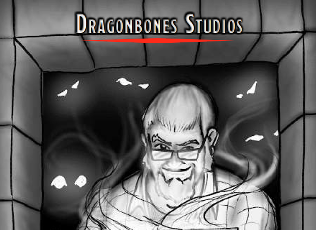
The cover is just a rough sketch, but all the art in it is my work, and I'm already working on a revision which will expand the book, provide more samples, etc. But with that said, I would love any and all criticisms / feedback / reviews / etc. Please - beat it up. :)

MORE
1/20 '20 6 Comments
Very nice! As a remarkably minor quibble, would it look nicer or read easier if each tier was on its own page? More room for extra art, unless there's some reason to limit the page count.
I'm struggling with that a little myself. I definitely feel like there needs to be more in the way of samples, but I don't want to load it so full that it loses its "This is a real WoC document!" feel. I've been working on a revision that includes more sections (what to expect from me, how I work, etc) and those will all have more art and then if I'm not satisfied there's enough, I would probably just create several pages at the end of the document that would be exclusively a gallery of sorts.

But to your question - I can't think of any real reason to limit page count aside from my desire to keep the file size reasonable so I can email it to folks.

I'll post future versions so you can see what I've done. I DO like the idea of keeping each tier on their own page if I can do it... properly. :)

Also - a heartfelt thank you for the feedback!
Do you need one document that explains all of this minutia? Part of me is like TL;DR. I'd love to see a "short and sweet" one page slick, and then if they want more, give them something like this that explains the whole process and the benefits and what-kind-of-client-are-you.

Run this past Jerm-- he makes this stuff for a living.

(With that, I know DnD people are a different breed, a breed who still actually *reads.* But sometimes a one-pager with a stripped-down image for cheap, a more detailed one for less-cheap, and a fully-realized beautiful image for spendy hits you harder. Their eye will be drawn to the fully-realized one right away because it's the purtiest. But in the thing you have here, people don't see your best work until they're a few pages deep... and who's to say they'll get that far?

Also, I love you dearly, but that front-page image isn't pulling me in. I see what you're trying to do, but I think you put your most gorgeous work on the front cover... and maybe put thumbnails of the same image at different pricepoints/detail levels around it so they can see the options you offer.

Just a scream of consciousness reply here... sorry if I'm not totally clear.
As usual, I feel like you're spot on. This is... call it an alpha version of the final document. I was thinking that I need a "tl;dr" page as Page 1. then people can proceed if the want to.

That said, I DO want to explain the minutia. For a number of reasons, not the least of which is the fact that people ALL perceive themselves to be on the Hobbyist level when it comes to what they're willing to pay for, but they want to use it for the Professional level of product. And here's the important part: They may still feel this way when they're done looking at my PDF, but _I_ will know that I gave them the relevant information and will therefor feel okay charging them in a way that I feel is appropriate. I know that you understand how difficult that can be for me.

As to the cover - you're right. As I mentioned in the OP, this is a rough sketch, and I'm working on refining it even tonight. It will eventually be a MUCH more refined and finished image.

I will absolutely run this by Jerm.

Lastly - the advantage to old friends is, I'm certain, that their perspective is very clear regardless as to whether or not they feel like they are being so. I read you loud and clear. :)

And, as usual, I'm being... overly verbose. I _may_ have had a bit of rum, so please forgive that. ;)
Update to the cover image for those who are curious: I'm working on refining the sketch. That hand under the tablet is giving me some trouble.

I've got an idea for the finished image that I'm unsure if I can pull off, but I'm going to try. There will be magical effects coming up / off of the tablet to the glowing eyes in the shadows behind me. Along with these effects, I want to give hints of a sword in the hand with the stylus (pen mightier than the... yadda yadda) and a shield on the tablet arm. These should be subtle though - something you have to be paying attention in order to see.

The idea is to present myself as a guardian between the viewer and the monsters in the dark. I keep them at bay until the viewer gives the go ahead to release them.

That seems like a worthwhile symbolism to start the document.
 

So I just watched a preview for S2 of Runaways. It's a Hulu Originals series based on comic book characters in the Marvel Universe.

I (of course) devoured the first season in the blink of an eye.

S2 is being released Dec. 21st. Which made me think: Are they releasing it right at the holidays in order to slow peoples' consumption of the episodes? I imagine that's a real problem these days. Companies dump all this money, time, and effort into a season of shows and then the consumers go through it in a very short span of time.

That would mean that the buzz / hype / social media blitz that they (the companies involved) might be looking for would last an equally short span of time. Sure, there will be outliers who will talk about the show in 3 months, but they will be just that - outliers.

THAT, in turn, got me thinking - how could you combat that problem? How could you get a longer 'bang' from your buck with a series like this?

The thought that occured to me was that you could build in game design elements. Puzzles (or puzzle clues) within the show that would mean nothing at the time, but then you (the company) could release something pointing people to those clues over time. A Time Released Alternate Reality Game of sorts.

Then, if you make the prize something really worthwhile - say a guest spot in an episode of the following season (which people wouldn't know until after the prize was won, of course) the hype you could get from such an event would be five fold: 1 at the airing of the show 2 during the hunt / release of the puzzle clues 3 when the fan wins the game 4 during the following season and 5 when media reports come out following the guest appearance in the subsequent season.

Sometimes, my ADHD is kinda cool.

MORE
12/1 '18
 

I have SO many questions. I'll start at the top:

  • As Seen on TV - Really? Someone paid good money to put this on television? Ever? This was clearly a rack toy - just hanging from a pegboard somewhere. For $0.79. Even when this was in stores, that couldn't have been a big profit margin.
  • Who is the Woman? - I don't recognize the character at all. Now, I know that there are many out there who have an encyclopedic knowledge of the Marvel universe, but I've got a little geek cred. I don't think I've ever seen her before. Is she a villain? Is she working with Cap? Is she at least wearing a bikini bottom that is conveniently covered by the bill of that plastic duck?
  • Pink / Blue Ducks - The only reason to have your targets colored pink and blue that I can come up with is to make them masculine / feminine. That's pretty sexist of me, but "it was a different time" and I can't seem to come up with anything else. Which begs the question: Why in all the holy REDACTED would you care what sex your plastic duck targets are?!
  • 3 4 3 - Why would you 'weight' the targets like this? 1, 2, 3 I could understand. 10, 15, 20 - sure. But 3, 4, 3? Pretty sure these folks were on something, or they're sending a message from the past to a sleeper cell that...
  • Larami Corp of Hong Kong - Larami Corp is familiar. Didn't know they were right here in PHL. Of course, the toy itself was made in... Hong Kong? I'm trying to envision how much they would have to save on the manufacturing to still make a profit after shipping it to the other side of the planet and only charge an end price of $0.79.
  • Oh So Cap or at Least American - Anyone else find it amusing that there is absolutely nothing Captain America about the gun, or the darts, or the targets. Just the cardboard backing which promptly gets thrown out when the kid opens the toy to play with it.
  • 2 Darts / 3 Targets - Just noticed this. Editted the post to add it in. This seems... inefficient. It also makes me think: there are two pink targets, but only one blue. Is there a correlation? But why is the blue more valuable? Is that another sexist thing?

It really was a 'different era'...

Oh, and I originally found this here.

MORE
8/31 '18 5 Comments
Beaten to the punch on the identification of the villain. Yeah, the '70's. It was a strange decade.

http://marvel.wikia.com/wiki/Nightshade
That seemed like a strange name, so I did some research and discovered that it was apparently a comment on the packaging's unusual pigmentation for "Nightshade", an evil scientist in Captain America's world.
Yeah - I did a (very brief) Google search and found nothing on Whiteshade, but also found Nightshade and wondered if that was just a... typo? Well, not exactly, but in that direction.
One of the tumblr notes says that is Whiteshade. Also, I hate trying to decipher tumblr's format. I'm never on there, though, so...
Wow. I'm just impressed that someone actually commented on Tumblr.