Matt Lichtenwalner

Mobile mapper for Ushr - roaming the US and Canada constantly. Maybe a bit of art and/or writing here and there to spice things up.

  • Followed
  • Follows you

Edit biography

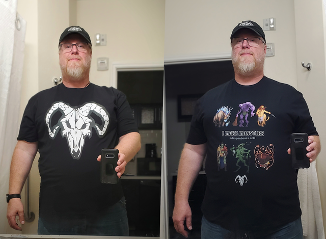
...and I don't hate them!

There's some weirdness, but nothing I am unable to live with.

For the curious: Dragonbones on TeePublic.

MORE
5/16 '23 4 Comments
Yeah - they're kinda fun. Now I wanna make more.
Your logo shirt looks fantastic!

No, that doesn't mean anything bad about the other one, just that the logo shirt really grabbed me.
Yay! Glad you like it!
 

I can't make a living doing these characters. Or, if that's possible, it's certainly not probable. Not by a long shot.

So what would I like to work on that does seem like it would be more reasonable to make a modicum of moolah on?

Crests. For clubs and groups. I feel like this is an untapped thing. Like, if more folks realized that they could get something like this done, they might. I've even seen more 'official' types doing this based on family lineage and whatnot. I wouldn't try to put on airs like that. I would just assemble cool symbols for things your into. Or if your D&D group has a certain collection of character types and items that might be assembled into a crest in a cool way....

really would like to work on labels for a distillery. Heck - those crests mentioned above would work for this. Something fantasy or viking theme, obviously would be ideal, but really, as long as they understand my style and aren't looking for an anime artist (because we're all the same, you know), I'm game.

Oh, who am I kidding? I would absolutely draw anime if that's what they really wanted.

Beer labels would work too.

I'd like to do some more tattoo designs (see some previous work here). That's unlikely though because most tattoo artists will do the design for free (or nearly so) and if you've done your homework on the artist in question - you know - because they're going to put their art into your flesh forever - you presumably already like their style.

What else?

Pet portraits or portraits of real people. Especially if it's a mashup of fantasy and reality. "My buddy as a barbarian." That kinda stuff. I'm admittedly not amazing at likenesses, but I can make it work, and honestly, it's an area I could use more work in to get better.

I've started doing tee shirt designs, but I'm really an amature. I've got a buddy who does a lot of graphic design work for cannabis companies and he gave me some great feedback on the existing designs in my merch shop. That said, it also made it very clear how far I have to go before I'm, you know, good.

MORE
5/11 '23
 

Jill "xtingu" Knapp said something in a brief chat recently that has me thinking about other folks who might appreciate the kind of illustrative stuff that I do.

So I decided to do some brainstorming, and this is the list I currently have:

  • DMs / Players
  • Developers (ttrpg)
  • Developers (apps / digital games)
  • TTRPG Adjacent Companies (Think Role Play Grow interviews)
  • Authors (children's books)
  • Authors (fantasy)
  • New Artists
  • Librarians / Bookstore Owners
  • Social Media Profile Owners

Anyone else have any ideas that I should add to the list?

MORE
Bookstore employees. Literacy campaigns. After-school programs. If you drew a picture of your nephews reading a big hardcover book, surrounded by a big male lion, a cool-looking elf archer, a mermaid, a giant robot, a lady scientist, a jungle explorer and a witch, you’d have every librarian, teacher and bookstore worker buying that t-shirt, poster and mug.
These are great - I'll add them to the list!
Now that everyone works remotely, and they all rely on Slack or Discord or some equivalent service, I think there's a market for someone to come draw avatars for everyone to use on their comms channels.
I’d use that.
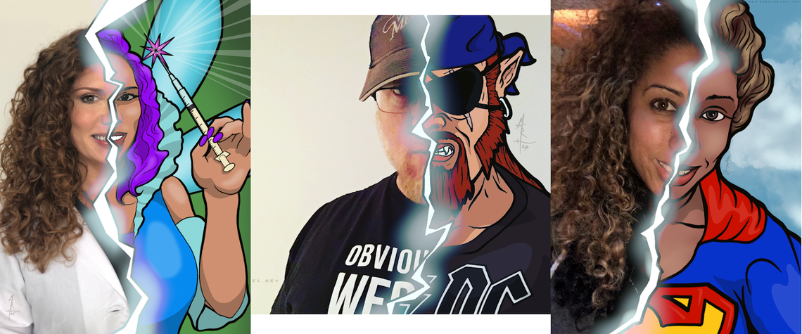
Thanks guys - I'll add it to the list. A couple years back, I did these, and they might work.
I like these a lot.
Thanks! They're even fun to do. :)
Considering the trend of creepy AI crafted avatars, I’d much rather have an artisanal hand drawn avatar that makes me look a little younger and healthier than I am in real life, especially if it has a real artist’s signature on it.
On Slack our avatars are so tiny that they might not work for promoting the artist much, which is a problem. But I have to have a team bio picture and I often have to have a professional picture for work presentations that are open to the public. How much do you charge for social media avatar images?
Something like what I did above would be between $30 and $60 (depending on complexity etc).

If you just need some "Photoshopping" of an existing pic to *ahem* 'remove imperfections' I'd happily do that for you for free. 😁
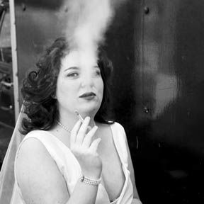
I like the idea of these, but for me the lightning bolt split down the middle makes it hard to see the person’s face.
Yeah - I thought about that a bit too late. You can see if a bit in the pics for the ladies. In theirs, I reduced the 'haze' given off in the area of the face. In the future, I would likely do even less there.
 

The folks at gmbinder.com are kinda brilliant. They've built a website that makes it easy for any old schmo like me build a PDF with all the formatting of a Wizards of the Coast Official 5e Dungeons & Dragons manual.

You enter simple markdown into one window, the website interperets the markdown, and uses CSS to spit the content back out in a second window with all the formatting done for you. No need to learn about different fonts or spacing or... whatever.

I've seen a couple different incarnations of this kind of thing, but GMBinder seems to be the best of them - at least that I've been able to find. And it's 100% free - at least currently.

So when I first came across one of their competitors, the idea occured to me: "This would be a great way to promote dragonbones.net and my illustration services. I'll make a short "D&D Book" that is filled with my art and talks about how to hire me to create the art for your D&D book!" It's kinda meta, and I think folks would like that. I've never heard of it being done before, and the name of the game when selling anything is 'stand out from the crowd'. So if I do this right, I can stand out from the crowd while demonstrating just how perfectly I fit in with the crowd.

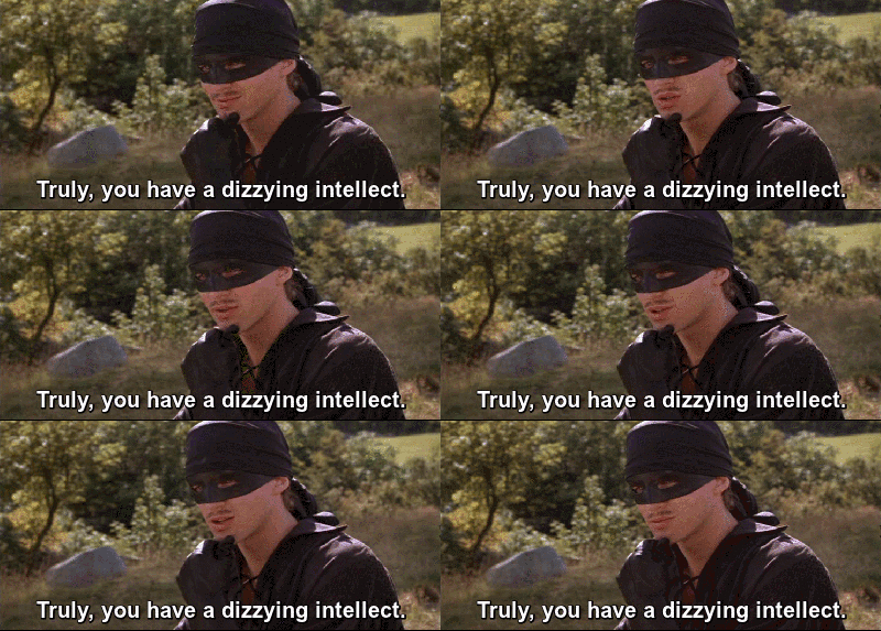
Oh shut it, Westley - it makes sense to me, and that's what matters.

Anyway - if any of you would like to have a look, you can find it here.

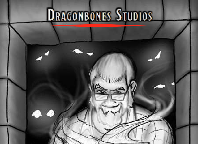
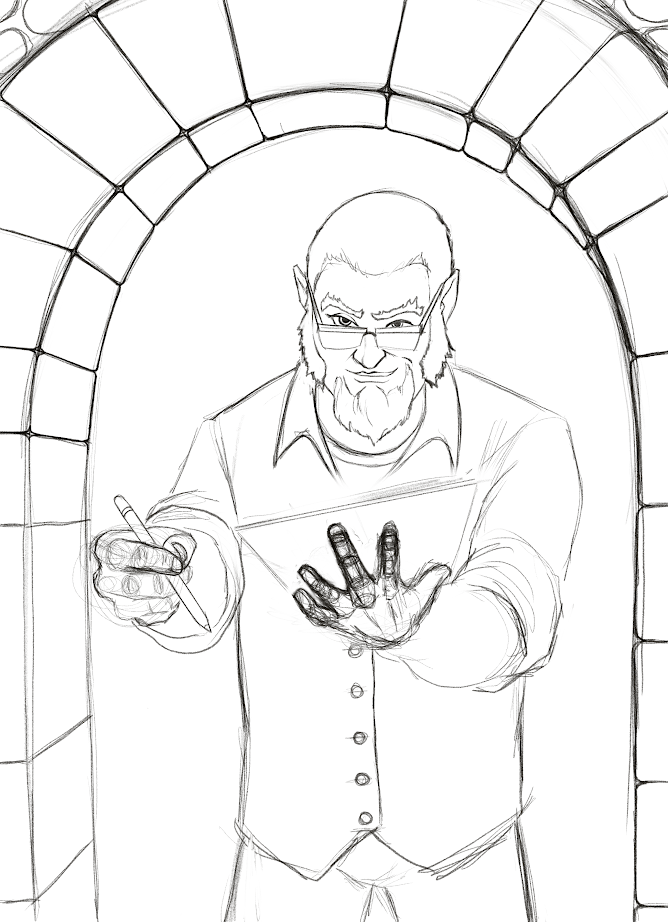
The cover is just a rough sketch, but all the art in it is my work, and I'm already working on a revision which will expand the book, provide more samples, etc. But with that said, I would love any and all criticisms / feedback / reviews / etc. Please - beat it up. :)

MORE
1/21 '20 6 Comments
Very nice! As a remarkably minor quibble, would it look nicer or read easier if each tier was on its own page? More room for extra art, unless there's some reason to limit the page count.
I'm struggling with that a little myself. I definitely feel like there needs to be more in the way of samples, but I don't want to load it so full that it loses its "This is a real WoC document!" feel. I've been working on a revision that includes more sections (what to expect from me, how I work, etc) and those will all have more art and then if I'm not satisfied there's enough, I would probably just create several pages at the end of the document that would be exclusively a gallery of sorts.

But to your question - I can't think of any real reason to limit page count aside from my desire to keep the file size reasonable so I can email it to folks.

I'll post future versions so you can see what I've done. I DO like the idea of keeping each tier on their own page if I can do it... properly. :)

Also - a heartfelt thank you for the feedback!
Do you need one document that explains all of this minutia? Part of me is like TL;DR. I'd love to see a "short and sweet" one page slick, and then if they want more, give them something like this that explains the whole process and the benefits and what-kind-of-client-are-you.

Run this past Jerm-- he makes this stuff for a living.

(With that, I know DnD people are a different breed, a breed who still actually *reads.* But sometimes a one-pager with a stripped-down image for cheap, a more detailed one for less-cheap, and a fully-realized beautiful image for spendy hits you harder. Their eye will be drawn to the fully-realized one right away because it's the purtiest. But in the thing you have here, people don't see your best work until they're a few pages deep... and who's to say they'll get that far?

Also, I love you dearly, but that front-page image isn't pulling me in. I see what you're trying to do, but I think you put your most gorgeous work on the front cover... and maybe put thumbnails of the same image at different pricepoints/detail levels around it so they can see the options you offer.

Just a scream of consciousness reply here... sorry if I'm not totally clear.
As usual, I feel like you're spot on. This is... call it an alpha version of the final document. I was thinking that I need a "tl;dr" page as Page 1. then people can proceed if the want to.

That said, I DO want to explain the minutia. For a number of reasons, not the least of which is the fact that people ALL perceive themselves to be on the Hobbyist level when it comes to what they're willing to pay for, but they want to use it for the Professional level of product. And here's the important part: They may still feel this way when they're done looking at my PDF, but _I_ will know that I gave them the relevant information and will therefor feel okay charging them in a way that I feel is appropriate. I know that you understand how difficult that can be for me.

As to the cover - you're right. As I mentioned in the OP, this is a rough sketch, and I'm working on refining it even tonight. It will eventually be a MUCH more refined and finished image.

I will absolutely run this by Jerm.

Lastly - the advantage to old friends is, I'm certain, that their perspective is very clear regardless as to whether or not they feel like they are being so. I read you loud and clear. :)

And, as usual, I'm being... overly verbose. I _may_ have had a bit of rum, so please forgive that. ;)
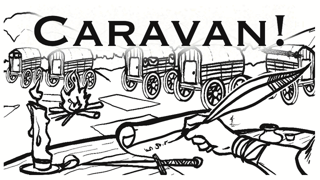
Update to the cover image for those who are curious: I'm working on refining the sketch. That hand under the tablet is giving me some trouble.

I've got an idea for the finished image that I'm unsure if I can pull off, but I'm going to try. There will be magical effects coming up / off of the tablet to the glowing eyes in the shadows behind me. Along with these effects, I want to give hints of a sword in the hand with the stylus (pen mightier than the... yadda yadda) and a shield on the tablet arm. These should be subtle though - something you have to be paying attention in order to see.

The idea is to present myself as a guardian between the viewer and the monsters in the dark. I keep them at bay until the viewer gives the go ahead to release them.

That seems like a worthwhile symbolism to start the document.
 

So a friend sent me a link to The Toolbox Fallacy (the video above).

He sent it saying: "If you're pushing yourself to do Inktoberfest, I figure there's a chance that you aren't where you wanted to be with your art, by this point in your life.

The following 7 minute vid is a potentially impactful one, about how too many of us wait too long and have too many excuses for not taking more action sooner, toward becoming who we want to be."

First, I thought it was very nice of him to try to give me a gentle prod in the right direction.

The tl;dr of the video is "Don't wait until you have the right tools or environment or... whatever. Just do the thing that you love to do." In my case - make art.

I learned something, but it's not what you might think it would be.

I've been aware of what this person calls the Toolbox Fallacy for many years. For me, it's pretty much never about "I have to have X to make Y." In fact, to the contrary, I've spent a non insubstancial amount of time cheerleading others to 'just get started' with whatever they have on hand. Or, at worst, finding something (anything) to 'make it happen'.

It's true that I'm not where I want to be with my art. To grossly oversimplify, where I would like to be is: "Making a significant portion of my income (or possibly all of it) via the sale of art I've enjoyed making."

The reason I'm pushing myself to do Inktober (think NaNoWriMo but art using ink) is because I want to break from my normal digital production. I'm using Inktober to force myself into a 90 degree turn. Okay, so it's maybe more like a 45 degree turn. The point is that it's a different medium, there's a timer running, and it's an intense 'workout' of sorts that I don't normally do. Something like using (as I recently mentioned to Lindsay Harris-Friel ) a reduced color pallet to force yourself to think differently. These sorts of workouts often lead me to some of my best breakthroughs.

"Okay, okay. We get it. You've told us what you didn't learn. Can you get to what you did learn already?"

Fine. Be that way. I'll get to it.

Essentially, I learned two things watching that video:

  1. I'm giving folx the wrong impression about the art side of my life. I suspect this is primarilly because right now the majority of the art I'm doing is hidden from most of the world. I'm doing this on purpose (to create a 'big reveal' when our game Conquest! goes live. Still, I need to find a way to share more of what I'm doing. Part of this feels like a social media thing, and I need to do some thinking about it. More to come.
  2. It's probably time for a change. I've been doing effectively the same thing with my illustration for... well, probably about 4 decades now. Sure, I've gotten better at the thing I do, but if it hasn't brought me to where I want to be after four frickin decades then maybe I need to change the process / model / product. I'm pretty attached to the (art) process and the product, so maybe it's time to focus on the model. I've spent a lot of time working on character drawings, saying "See what I made? Don't you want me to draw your D&D character for $0.50?!" Just like the guy on the street corner who's asking for a buck, most folks just mumble some excuse and scurry away. The two people a year who actually drop a buck in my offered cap aren't enough to pay the bills. So I need to figure out something to get more work coming in the front door. Here again, I need to do some thinking about this, and I'll post more when I've figured something out.

Stay tuned, True Believers.

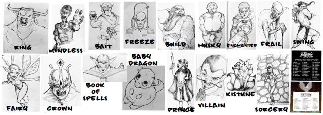
A quick (and terrible) collection of the images I've done for Inktober so far.

Top row is the 'standard' Inktober themes. Day 1 was "ring" and Day 9 was 'swing'.

Bottom row is the 'whimsical' list starting with Day 1 "fairy" and Day 8 'sorcery'. I haven't finished Day 9 for the whimsical list. (I'm posting this 10/8 so I'm a day ahead on the 'normal list'.)

MORE
10/9 '19 4 Comments
uh... is the video gone? NEVER MIND. Found it. Thank you. I needed that.
I loved the video. I sent it to Rog's nephew and he went nuts for it. I got some things done today after watching it. Thanks!
This video is life changing.
Thank you, dear friend.
Thank you for sharing this.

At work, I’m focusing on similar topics. Some of this is customer retention, ie., “if you’re having trouble with x, have you tried our course about xy yet?” and general Cheerleading.

Meanwhile I’m not working on my own art, so... PHYSICIAN, HEAL THYSELF!
 

I had the good fortune to have brunch with the lovely Miss Knapp this morning. As is often the case after spending time with creative people, this has me on a bit of a high and feeling very creative / inspired / wanting to be productive.

So that’s the mood I was in when I hopped in my car and started heading back down to Maryland.

All of that is backstory to explain where I got the idea to create a Knappucino’s for Illustrators.

So here’s some thoughts I’m working through to see if this would be a worthwhile venture:

  1. Would it be worth it for me? What’s my objective here? I mean, the arts are generally not a side hack you want to start if you’re looking to get paid. You either go all in, or you go home. There just isn’t room for ‘half way’. But maybe money isn’t the point. It’s certainly not what triggered the idea. The idea was feedback from the audience to the artists. Much like the original Knappucino’s wasn’t so local unknowns could get paid, but rather that they could try things out with an attentive audience who cared about such things. It’s a different starting point than most gallery showings I’ve come across.
  2. Do artists want feedback? I know that I want feedback, but maybe I’m an oddball? Maybe it’s more of an illustrator thing. Since we tend to be more mercenary about our work than fine artists, the audience opinion matters more. Or at least, their feedback should. 
  3. Do I want to invest this kind of time and effort? I know that Jill put a lot into the original. Perhaps much of this was emotional effort (I don’t want to presume to speak for her) but I have a pretty simple live right now. Chop wood, carry water. Repeat. More possessions and more activities create more stress. This is something I have to pay attention to.
  4. Would I want to do this as a ‘pop up’ concept? A long time ago, I came up with an idea (I wasn’t the first) to do pop up galleries utilizing unused strip mall space. Getting folks to come through would potentially lead to business for the mall property owners, and it would provide me with free (too much to hope for?) space for the shows. This seems like an obvious extension to that idea. Would that just be making things overly complicated though?
  5. How would it work? Simple is obviously the name of the game. At least to start with. So here’s my rough idea:

5a. I would try to control the flow of the audience through the space. Nothing super rigid, but creating a ‘direction of travel’ will help with some of the other elements we’ll find below.

5b. No artist’s statement. Start with the art.

5c. At the end of each artist’s section, there are printed forms for the audience to fill out. The forms are crazy simple: 3 questions to direct the flow of the feedback (see also: the Start with This episode dealing with Feedback - https://beta.prx.org/stories/273387) AND a space for people to write in their email address if they want to join the artist’s email list.

5d. Rinse, repeat for each artist in the show. (Initial shows would be kept to something like 3 or 4 at most - because KISS.)

Anywho - that’s what my brain is chewing on right now. Oh, that and the charity illustration I’m doing. Speaking of which - I should really get back to that now.

MORE
5/13 '19 2 Comments
Isn't that Dr. Sketchy's?
Good point. I would say that it’s not quite, but in that direction. There’s less... interaction between artists. I mean it IS social, and there IS adult beverages, and a more relaxed setting, so one COULD do what I’m talking about there, I suppose.

It also doesn’t have the gallery aspect. I mean sure, we all review the artwork and pick a favorite, but I’m thinking more specifically about the “After I hung it on the wall, someone asked to buy it from me.” thing.

Hmm. Perhaps I should just push that agenda at a Sketchy’s. It certainly wouldn’t require as much effort on my part.
 

I recently mentioned that I'm working on my plans for my illustration work. Well, I've put up a pretty big (for me anyway) post over on my site. If you're interested in such things, I welcome any thoughts you have on the subject.

MORE
1/23 '19 2 Comments
How much you you charge for a 11 x 14 custom color painting (kinda like the one in your post, but with a girlchild, and visions of roblox, quidditch, cats, minecraft . . .) I'm <redacted> if you wanna talk directly.
I've copied the email and will send you something shortly. Since I now have it, you may want to edit it out since this is a public post.

Or not. I'm not the boss of you. :) (Just being a touch paranoid on your behalf.)