I'm back to work updating OnePo's codebase to modern standards on the server side. Specifically async/await as opposed to callbacks. it's BOOOOO-RINNNNG. But I have "only" one file left. Of course, it's the one where most of the code is.

So after that I should refactor that file as well. Also BOOOOO-RINNNG, and yet somehow satisfying. Then maybe crank up eslint to call me on my shit. Poor man's typescript. Then maybe typescript?

Then rethink the frontend code. Using [ugh I will not even think about choosing a framework today].

Of course OnePo is still a tiny, tiny place. As in "I've never bothered to index the database collections for performance" tiny.  I may need to dial up the disk space just a tad soon though.

"But Tom, aren't you gearing up to welcome former Twitter residents?" No, not really, although the six people who will actually leave in this, the most recent of many outrages are warmly welcome.

Moderation of a successful public social media site is a huge, unsolved problem. As others continously have pointed out, the real challenge for something like Twitter is moderation, not engineering. Yes, it's bad that Musk's plan is basically to fire the moderators.

But I'm in no position to improve on that. There's no moderation in practice on OnePo at the moment, although I'm pledged to supply some in the event of certain types of abuse.

What we have instead is an invitation-only model and a predilection toward thoughtfully locked posts, which reduces (though it absolutely does not eliminate) the likelihood that someone you're connected to needs moderating... at least from your perspective. So far this seems to work OK for our needs.

But, a system like that cannot function as a public square. If we indulge my ego in imagining OnePo writ large, we wind up with a worse echo chamber than Twitter, because it's so difficult to discover new people and the general habit is to limit audiences for things.

Also, OnePo is just a whole 'nother idiom. The intersection of OnePo and Twitter is a ridiculous idea. That would be... uh... BeReal, actually. BeReal is pretty fun. But it does one tiny job.

Actually I kinda like the idea of doing one tiny job. OnePo's one tiny job is allowing friends to know and support each other better. That's fine for what it is, which is a lot.

MORE
10/29 '22 9 Comments
"modern standards on the server side" sounds like lyrics to a Joe Jackson song.
And with our modern standards on the server side
Get into a car and drive

Checks out.
Haha, I can hear it in his voice.
a feature that I think may bring more people would be something tumble like where you can search posts by date or "random post."

There are a lot of times I've needed to check something that happened, say, more than six months ago, and I've thought, Oh, I should check OnePo and- Nope. But I also understand that I can search by tags and I owe it to myself to tag more of my own posts.
Search would be nice I agree. I don’t know if it would lead to growth because you have to be able to see stuff in the first place… which means public posts.

Also the existing users have invited everyone they want to invite, and there’s no other on ramp right now.

Hmm.

Maybe a communities feature, he said, continuing to reinvent livejournal.

Maybe a signup that more clearly paves the road to bring your community with you.
typescript just copies all I/O to a file, right? :)
Knew you were listening.
Any recommendations for good tutorials on properly implementing async/await? Asking for a bearded friend trying to get up to speed on contemporary JavaScript.
Did you want to push this site? I have considered posting content here and posting a link to it on facebook.
 

Some small OnePo improvements and fixes:

  • Making links to other pages the traditional way, via the "link" icon and the dialog box, works again on the iPhone.
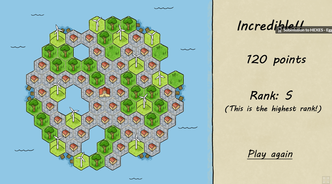
  • You can also make links by just pasting a link to any page straight into your post, without clicking the link button. When you do that, a nice automatic preview and link appears. We've had this for ages, but there was a dumb bug that broke it for most cases, except YouTube. All fixed. Here's a nice example (and a cool game):

You'll note I didn't have to create any content for that, I just pasted the address of the page straight into this post. This is based on the "open graph" tags that websites already provide for the benefit of Facebook sharing.

  • Speaking of the automatic link feature: pasting a URL like that in the middle of your text once again splits the text into two sections, with the link preview in the middle.

As I mentioned, you can still make links the old-fashioned way too.

(At this point I don't care that I'll never be able to buy the domain onepo dot com. I'm still going to call it that, because how can you not?)

MORE
7/3 '22 6 Comments
Very nice work sir! Seems like an elegant solution, and makes things both clean AND pretty.
Also, I’m going to have to check out that game.
Many thanks, dear host!
Stinker! I haven’t broken 101.
 

Hi gang,

I saw a couple of friends coping in a DIY way with a possible bug today (tough to say at this point), and it prompted some thoughts about how little attention I've given the platform in a long time. My last push to the server was... cough... two and a half years ago.

In a way this is not such a bad thing. Hey, it works!

But there's a lot that could be improved, and long-running bugs that haven't received attention (notifications for your own replies, anyone?), and believe it or not I'm still interested in the question of whether I did everything I could to make it easy for folks to onboard and, yes, grow the site.

But of course there's very little time.

Meanwhile... recently in another context I was facing pleas to do more in a space that's outside of my more essential responsibilities from day to day. I am very well supported at work. But as in any workplace there are gotta-haves, wanna-haves and really-oughta-haves and it can be tough to juggle them.

So I struggled to organize this really-ought-have stuff as a Project. But a Project implies a Budget and Time and there is no budget or pre-scheduled time for that particular thing right now (darn those pesky gotta-haves). That meant everything I was writing felt like a recipe for stress.

I felt stuck, and anxious.

Then I noticed a kanban board feature in our internal wiki and deliberately created an itty-bitty kanban board to track progress in that particular arena.

When I was asked if I wanted to turn it into a Project instead... I said "nope!" Because the medium is the message. Project = Milestones. Schedule. Release Dates. Time Pressure. All of which are appropriate when resources are available, and needlessly stressful when they are not.

But a kanban board says "hey... this is the art of the possible! Nibble at it. Bash at it. Occasionally really go at it. You'll get there."

My kanban board at work turned out very well and I'm still using it to nibble away at the oughta-have thing I can only work on occasionally.

So in the same spirit, I plan to set up a kanban board for One Post Wonder.

And today, in that kanban spirit, I did three itty bitty things to move the ball forward:

1. The "submit a bug" button just sends me a damn email. It used to post an issue to my github project, which was too clever by half. I didn't get any notifications, I didn't pay attention and you probably felt neglected. I'm sorry about that. This should be better.

2. I fixed an issue that caused gmail to reject some emails from One Post Wonder. There are services you can pay to deliver your emails reliably. Cost aside, I feel it's important that we try to maintain independence in this area. Even though it's a pain in the ass and an ever-moving target.

3. I changed the welcome message you see when you sign up from "each day, post a carefully curated sonnet concerning the state of world affairs or you will be punished with lasers" (*) to this:

"It doesn't matter if it's a cat picture, a duck joke or a column worthy of Alexandra Petri."

I think this is way more welcoming, and I hope it will encourage people to feel like it's OK to just chill here. Lord knows I do. Shitpost away, everyone. You just can't do it more than once a day.

(*) It didn't really say that. It was far more well-intentioned but still kinda intimidating.

MORE
8/28 '21 12 Comments
I hope you know that this will go down on your permanent record.
I don’t feel tardy.
Tom, I'm very grateful for all the work and thought you've put in to creating friendly online spaces over the years. You have such a knack for it, and you do us all a great kindness. Thank you.

Perhaps you could share some of the "work" of it with some of us who code, if you and they are willing? Maybe you've all known each other long enough that it's time to grow into more of a cooperative model? I daresay you needn't shoulder this alone.
I should mention that Sean coded quite a bit for a while in addition to doing a beautiful job on the design. I am only now finally thinking a refresh might be in order. It still looks great.
Tom did canvas for contributors and, mea culpa, I signed up and then kinda got bogged down in even trying to get my development environment off the ground - OPW uses a few things I'm not au fait with and had to read up on. As a result I've had the code sitting on my laptop for several <embarrassed small print>years</embarrassed small print> without me doing any more than poking ineffectually at it.
No big, man. I could see that readability was an issue with that old school callback library, and I started a conversion to async/await style which is much more readable and maintainable, but did not finish. I should try that again in a more incremental way.
I am thinking about moving it to Amazon Lambda and such, which would be good for scalability and good for my skill set.
Ah, Amazon Lambda, or as they called it in the old days, "buying CPU time on the mainframe."
Heh. It’s just that I keep solving things with old school scripting on servers I fail to treat as cattle. Need a shakeup.
tsk, don't diss my employer's cunning dressing up of old tech as new. Now, can I interest you in a punchcard?
I WRITED SOME CODE. I HOPE YOU LIKE IT.

LOVE
WAIDER
https://www.boardgamegeek.com/boardgame/109276/kanban-drivers-edition is a game about optimizing your automotive assembly line, and I'd heard about it but never bothered learning what "kanban" meant.
 

For a while I've thought it might be a little too confusing, the way One Post Wonder separates "following" people from "giving keys" to people. But, I also suspected this was just my ego talking: surely people would use One Post Wonder more if they only understoooood it!

Also, that distinction is hugely important to many of you. The way other social networks... socially engineer... connections you don't really want is something you've asked me to avoid.

So I haven't made any changes in this area in a while.

Today, though, I got feedback from two very smart-but-busy people who had the same confusion: they didn't catch that you have to give out keys if you want your friends to actually be able to read your wonderfully private posts.

So I made what I think is the right change.

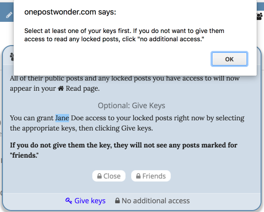
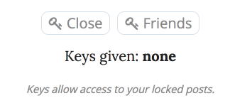
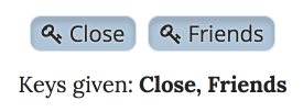
When you follow someone, you are already given a chance to give them keys. But it's worded in a very chill way... it's sorta hard to tell if you have actually selected any keys or not... and if you click "Give Keys" without actually clicking any keys, there's no warning.

Accordingly, I added that warning message. And I also went ahead and added a bold-text message explaining bluntly that this ain't Facebook.


I think this will help a lot. Although, even as I look at it, I see a problem: we're referring to those buttons as "keys," and they have lock icons.

[Headslap]

... I'll fix that too. 😂

EDITED TO ADD: even more grease!

That should do it... I hope! 

MORE
6/21 '17 12 Comments
I'm happy to create a 'key icon' if that would help. What dimensions would you want it? (And I'm assuming that PNG is a good format? ;) )
By the bye, at one time PNG would have been the choice, but we are using fontawesome, a symbol font full of vector scalable goodness.
No way man! PNG 4 lyfe!

*pumps fist*
Thanks Matt, we do have a key icon. We just weren't using it ideally. Thanks again for the offer!
No problemo!
Ok, so......

Just for fun, I went to my list of mutual followers. When I click on an individual, it looks like they have a key to read my locked posts. I see the word "friends" with a little key next to the word. So I'm assuming that person can read my friends-locked posts. Just for grins, I clicked on "give keys" anyway, to see what happens. A big blue button appears below it, again with the key icon next to the word "friends." Well, who doesn't push a button when they see one, amiright? I clicked on the jolly candy-like button, and now there is both a key and a LOCK icon next to the word "friends."

What in the world does that mean?

I'm thinking I may have never understood this whole lock and key thing in the first place.
Just clicked my way through this.

In summary:

1. You did it right the first time, everything was the way it should be.

2. There's a bug in the code for the "now you have DE-selected this" state for that particular case of editing keys. It leads to the confusing double icon you saw. I will fix it.
By "you did it right," I mean you had it right IN THE FIRST PLACE (yes, you gave those friends the keys they appear to have already, no, you don't want to toggle anything). Sigh, language, it is hard.
Update: I fixed the weird double icon situation that Anne saw, and I also added a new "keys given:" list to both the invite dialog box and the workspace where you edit your keys for someone. That list updates as you add and remove keys.

It should now be SUPER DUPER CLEAR AT LAST when you have given keys and when you haven't. I hope. (:
Er... welcome, friends! It turns out that I completely forgot to make copies of my keys.
Brian: eek. Thanks for confirming the extent of our failure to communicate. Hoping the new setup will be ever so much better.
I am prepping to send out a blasto email to everyone who, according to a little math, probably fell victim to this. In an anonymized way. Perhaps we'll spark a little renewed interest, although I suspect we'll mostly have to wait and see how it goes with newly invited friends.
 

Some things are new on One Post Wonder today:

  1. Follow Fridays! This is very simple: on Friday, the "suggested topic" is always "who else should your friends follow on One Post Wonder?" and there's a little "Follow Friday" indicator. When posting, consider using the little-person icon, which is a handy way to mention someone in your post. It is my hope that this will help people who show up with just one or two connections and never really get "plugged in" beyond that. 
  2. By popular request, the header bar now stays with you as you scroll, even on phones. But I am interested in feedback from folks who may have been happier the other way. Let's see how this goes.
  3. Numbered lists (as you may be noticing).
  4. Strikethrough (as you may be noticing).
  5. The plaintext versions of important emails like account confirmation emails have working URLs in them. This is important to my fellow nerds people who for various valid reasons loathe HTML email, and possibly other corner cases.
  6. When you paste a URL into your text and OPW makes a nice little presentation block out of it, the URL field gets populated right away.
  7. The "bug report" icon is only available to logged-in users now. Which means no more spam for me to sort through. Which means I will pay better attention to your bug reports. w00t.

What would you like to see? What do you think would help the platform reach more people for the right reasons?

MORE
I would like it if when I made posts "public" to OPW, I could also keep them "private" from showing up in search engines. That was one LJ feature I truly miss. It was a way for Journal users to find and add me, without random google searches splashing me and all my thoughts on the wall. Does that make any sense? Or should I just be resigned to such things?
Well, a flag to make it a "noindex" post is possible, but I'm concerned about the people who will expect this to be more than it is, in terms of blocking tools that don't care about such niceties, or people who are already stalking their journal for public posts.
I guess I'm saying I'm open to suggestions on the wording.
Wouldn't the simple solution be to give it a link to more information and just explain briefly what it does and doesn't do? Or is that going overboard?
These sound great! Looking forward to testing everything out. :)
I like numbered lists, strikethrough, the top bar staying on mobile, and I don't know if it's iOS or OPW, but the photos are easier to enlarge on mobile too!
Interesting! I don't *think* I changed anything re: photos.
Does your iOS stay logged in for you as you go on with your life and then click in another day? Had some trouble with that on Carrie's phone last night.
Yes iOS stays logged in - I use Safari, not the app because I had
Memory issues on a previous phone and never bothered to switch when I got the new phone.
App? I ain't got no app
I thought there was one but I didn't have it. Ok, I am not as backward as I thought.
Nah - Tom's clever enough to realize that apps seem pointless at times, so he makes his web apps work for mobile. Reason number 8540778052 I'm a fan.
If I'd had the time and money when OPW launched I would have done an app. Today though...

On desktop and on Android, websites can now have their own notifications if the user opts in, even if you're not on that website or in that browser right now. And the feature is coming to iOS, folks suspect this year.

With notifications added there is precious little reason to write an app unless you need the zero-friction cash flow of in-app purchases. (Yes, yes, they take a huge bite, but does the user want to give your rando app their credit card number? By finger typing it? No they do not.)
I am reminded I need to send in a bug report re: some Notifications wonkiness. I will try to do that today.
 

Insane day. A yadda yadda decided that everybody had to have a floopy blawnox 2016 because they didn't feel like maintaining floopy blawnox 2012's anymore even though they sort of promised but not really? And suddenly I had to cope with all the fallout because the floopy blawnox 2016 doesn't quite fit into the floobistan. Quite. Almost but not quite. You can make it work, but it takes all day and then you have to use a replicator to fix all the other floobistans but some of them are slightly irregular and you have to use the replicator AGAIN, and pretty soon it's 6pm.

In addition to my day job, this also impacted One Post Wonder, just now, as some of you who saw my test comments will likely have guessed. So here's hoping you can read this.

❤️,

#1 floopy blawnox herder

MORE
10/6 '16 10 Comments
But why'd you have to write the post in perl?
My life is a Pathologically Eclectic Rubbish List.
I suggest applying Runge Kutta
Runge Kutta is my new MC name
Today I had no plinths to garble, so I garbled blawnoxes instead. Which is weird, because this time last year I was garbling blawnoxes. I think a lot of people need blaw.
Every time I think you're getting a grip, I catch you garbling blawnoxes behing the shimmenhaus. Tsk
They're not gonna shaw themselves.
Said that right.
You're the floopiest.
 

Hey oneposteristas,

Apparently posting from Android was jacked up big time.

Sorry.

I am embarrassed to say I post rarely enough from my own Android phone that I didn't experience this for much too long.

But, it's fixed now! I installed a newer version of ckeditor which resolved the underlying issue.


I also added a "+" button for adding the next tag, in case you're on a device that won't let me capture the comma key for that purpose, which has been my own experience on Android.


MORE
6/30 '16 2 Comments
Thank you!! I thought it was just me.

Yaaaay!
Oh hell yes! I did this in time to help someone else genuinely affected!
 

Please do not adjust your universe. The slight disquiet you feel is because I've moved OnePo, Boutell.Com, and everything else I run to a different hosting provider. I did that to get more storage, better backups, and more RAM for less money. More RAM, in this case, cuts down on disruptions when I deploy my other apps. The old b-com was running pretty close to its limits.

I've been banging on all the bits and validating that everything is here. For instance, I'm attaching a photo to this message.

That photo just about sums up my present situation: disordered but excellent.

MORE
3/26 '16 7 Comments
Red is a great color on you. I really like that photo.
Seamless, did not even notice there was a new universe.
And I agree with Shelle. You wear red well.
Great picture! It looks like you placed the photo in the middle of the text? Like, there's text before and after (I guess that's what in the middle means; okay, moving on). When I put a photo in my post, I seemed to have only two options, either at the beginning or end of the post. True?
It could be potential misleading. You can create 'blocks'.

Example:
You could create a block of text.
Then a block of Image.
Then a block of text.
Then a block of video.
Then a block of text.
Etc.

You always have an option to add another block of content (whichever type of content you wish) at the bottom of whatever you're currently working on. This allows you to continue indefinitely.

You can also move blocks of content up or down, though I found this a wee bit tricky, so I try to think through my posts and build them in the order I would like from the beginning.

Hope that helps! (Feel free to ask me to clarify or answer any additional questions. :) )
Yes, this.
Got it. Thanks.
All systems appear to be functioning normally Captain.

Have I said thanks for doing what you do recently? Because I should. :)