 The welcome wagon gets a little grease
6/21 '17
For a while I've thought it might be a little too confusing, the way One Post Wonder separates "following" people from "giving keys" to people. But, I also suspected this was just my ego talking: surely people would use One Post Wonder more if they only understoooood it!
Also, that distinction is hugely important to many of you. The way other social networks... socially engineer... connections you don't really want is something you've asked me to avoid.
So I haven't made any changes in this area in a while.
Today, though, I got feedback from two very smart-but-busy people who had the same confusion: they didn't catch that you have to give out keys if you want your friends to actually be able to read your wonderfully private posts.
So I made what I think is the right change.
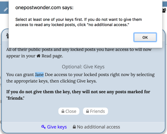
When you follow someone, you are already given a chance to give them keys. But it's worded in a very chill way... it's sorta hard to tell if you have actually selected any keys or not... and if you click "Give Keys" without actually clicking any keys, there's no warning.
Accordingly, I added that warning message. And I also went ahead and added a bold-text message explaining bluntly that this ain't Facebook.

I think this will help a lot. Although, even as I look at it, I see a problem: we're referring to those buttons as "keys," and they have lock icons.
[Headslap]
... I'll fix that too. 😂
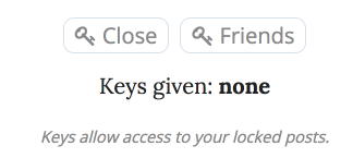
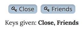
EDITED TO ADD: even more grease!


That should do it... I hope!

*pumps fist*
Just for fun, I went to my list of mutual followers. When I click on an individual, it looks like they have a key to read my locked posts. I see the word "friends" with a little key next to the word. So I'm assuming that person can read my friends-locked posts. Just for grins, I clicked on "give keys" anyway, to see what happens. A big blue button appears below it, again with the key icon next to the word "friends." Well, who doesn't push a button when they see one, amiright? I clicked on the jolly candy-like button, and now there is both a key and a LOCK icon next to the word "friends."
What in the world does that mean?
I'm thinking I may have never understood this whole lock and key thing in the first place.
In summary:
1. You did it right the first time, everything was the way it should be.
2. There's a bug in the code for the "now you have DE-selected this" state for that particular case of editing keys. It leads to the confusing double icon you saw. I will fix it.
It should now be SUPER DUPER CLEAR AT LAST when you have given keys and when you haven't. I hope. (: