Oh hey, picture comments 10/21 '18
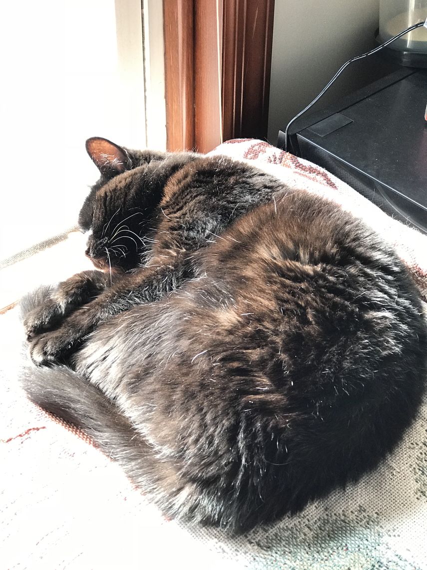
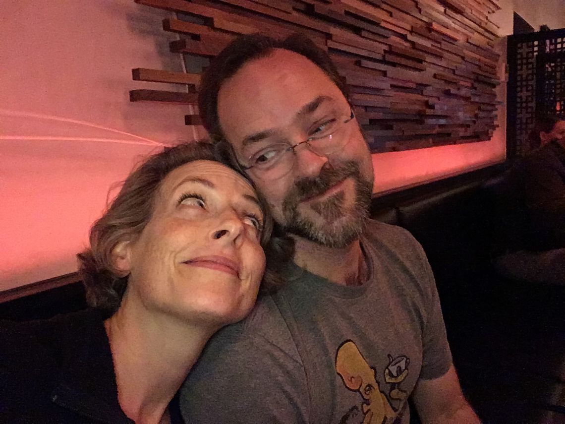
... You are looking cute!
Specifically, you'll note there is now a little picture icon after you hit reply.
Currently you can post either a picture, or text, not both in a single comment.
Enjoy!
... You are looking cute!
Specifically, you'll note there is now a little picture icon after you hit reply.
Currently you can post either a picture, or text, not both in a single comment.
Enjoy!
I just wrapped up the followup work I mentioned on making sure existing notifications in the system go away when someone gains or loses access to a lock, or the lock is removed, or the locks of a post are updated.
I need to be realistic about this: I'm one guy, alas, and there will be issues. These were minor in terms of people affected and likelihood of impacting someone. I think I've designed well to avoid more serious problems. I could be mistaken.
So the best I can do is try to be proactive, be responsive when things are pointed out, and oh yeah, be straight with y'all that I'm one guy.
So yeah: I'm not the entire Internet security department of Amazon. Consider yourself reminded. (:
If OPW were to grow, making sure there is a second engineer involved regularly and a code review process in place would be a priority for me. It's not intended as a high-wire act.
(Edited to add: Sean made many large contributions to OPW, including tons of code. Grateful for that! I'm thinking more of what would happen if we had a real budget in terms of best practices for review.)
So how big is OPW anyway, and will it grow? Well: it's tiny. There are about 25 posts per week.
And: it's constant. There have been about 25 posts a week since things settled down in 2015.
But everybody who's here really likes it here. So!
We'll see if little changes like the new Network posts indicator help bring the occasional newcomer more successfully into the fold. But if not... hey. It works for us.
I made two security fixes just now:
1. Previously, if you knew the id of a post and were a mutual follower of the poster, you could comment on it, even if you did not have the keys to the post. Note that this did not mean you could see the post. However, see below.
2. If you had commented on a post, you would continue to receive notifications of later comments on that post, even if your own access to it had been revoked. Notifications contain roughly 100 characters or so of each comment.
Both issues have been fixed. I apologize for these mistakes in my code.
At no point was it possible to read an actual post you should not have been able to read. But, security issues are never good.
Many thanks to the user who brought issue #2 to my attention, which led me to discover issue #1.
Edited to add: notifications already in the system are still there. I will be working to purge those, and also to purge notifications as needed whenever the privacy settings of a post change. Of course an email sent is an email sent, but I should do what I can do.
On OPW, it's tough to get in the game. Newcomers make public posts, hoping to connect; the rest of us might see them if we're already connected to that person, but otherwise not. There's a "Network" button, which shows public posts from second-degree connections... but nothing calls attention to new posts there. Or did, anyway.
So I've taken a stab at improving on this: there is now a separate new-posts counter for the "Network" page. You probably see it right now, singing its siren song.
Since we didn't keep track of the "last read" post in the "network" feed until just now, that counter is probably showing you a big number at the moment. And hey, that might be right, if like me you weren't in the habit of checking it out.
In the future, though, it'll know when you last read the "network" page, and limit itself accordingly. So I think this will be much more useful as a way of discovering new folks.
While I was at it, I also changed the other "Network" button to "People." Hopefully emphasizing its separate role as a place to edit your connections. Because yeah, confusing. Little things matter.
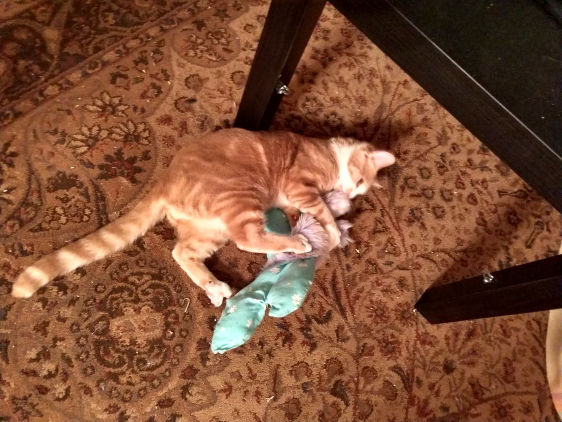
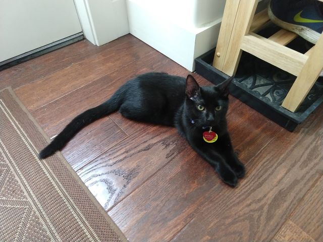
And speaking of little things: kitten!
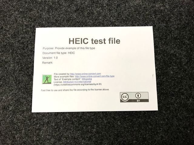
iPhones have a new feature: as of iOS 11, they don't save photos in the familiar JPEG format. They save them in a new format called HEIC. It's very nice. Web browsers can't handle it. Until today, OPW couldn't handle it either.
However, Rabbit was kind enough to point this out with some useful pointers in the right direction, and I found tools to convert HEIC to JPEG.
So, please enjoy the ability to once again attach photos to your OPW posts from your iOS devices.
For those who haven't tried it before, look in the lower right corner of the editor, where you see the words "Add Media." To the right of that, click the little picture icon, then the browse button that follows.
Enjoy!
In fulfillment of Shelle's longstanding feature request!
You can now export your One Post Wonder posts. Just:
1. Click "Me" (top bar, third from right).
2. Look at the little buttons above your tags: Account, Edit portrait, Edit bio... Export!
3. Click "Export." Big shocker there.
4. Wait a few seconds and KAFLOOP: big HTML page downloads to your computer.
5. Save that puppy!
6. Open it up, just by double-clicking it, for most of you anyway. Admire your fine words.
7. Want to print just one tag? Click on that tag first, then click "Export." KAZOOM: an export of just that one tag.
OK, now some catches:
1. It's not phantasmagorically beautiful. I haven't had time to fuss with the print styles much. You do get page breaks between articles. You don't get a table of contents because that requires a Considerably Different Approach.
2. The images you see in your export are being loaded from the website. So if you were to delete your account, they would be gone. The easiest workaround is to hit "Print" and then "Save as PDF"; this will take a while, but you wind up with a PDF file that permanently includes copies of your images. Heck, you could even print it. Hope you've got plenty of paper and ink.
My near-term intention is to change this feature so you get a zipfile that includes your images without the need to make a PDF or use any mirroring tools.
Hope you enjoy! I'm pleased to have finally delivered this feature. In addition to how nice it is to be able to export your stuff as a "book" sometimes, it also fulfills a more fundamental promise: the freedom to leave without strings attached. Speaking of which, the markup is semantic and fairly easily parsed if you want to Do Things With Code; article elements are exactly what you'd expect them to be.
In deployments today and yesterday I also updated some security matters and made sure OPW is running on reasonably up-to-date and maintained Node.js modules. That took a lot of moaning and groaning, and introduced a few minor bugs (like momentarily invisible comments) that have since been fixed. Mutter, mutter.
But it's worth it; I care about this little blog on the prairie. It's where I keep my stuff.
By request (!), everybody here now has a metric crapton of invites.
As promised, you can now leave One Post Wonder permanently without asking for my assistance.
To access it, one clicks "Me," then "Account," then scrolls down a wee bit to the bright red words "delete my account."
I hate it when "delete my account" is hidden or absent. Had anyone actually asked for it, I would certainly have added it sooner.
I also dislike when the process contains unnecessary roadblocks. So my first take on it did not have a "confirm your password" prompt.
However, when I took a good look at the result, I realized that an unintentional, cat-powered or mean-jerk-powered account deletion was a real possibility, and that people do tend to value a journal they've been posting to for years.
So at some cost in convenience, I decided the password confirmation prompt was a good idea overall.
It's most annoying, of course, if you've forgotten your password. So the "hmm, sorry, that's not right" message also includes a suggestion to try the password reset feature if you're stumped.
I think this is a good implementation of a feature I hope will be rarely needed.
My next goal is a decent export feature, something that produces static HTML pages that a user of typical technical skill can figure out a way to enjoy.
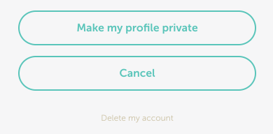
If your screen is very, very good and your eyes are sharp, maybe you noticed the actual "delete my account" button. Fawkers.
But I don't get to criticize. Because ya know what OPW doesn't have? A "delete my account" button. Shame on me.
I'm publicly shaming myself here because I need a little motivation to release this feature, which is completely coded and ready to go — I just need to test it a little more.
Cue Neil Gaiman quote.