Some have noticed a brief outage earlier today. That was me, moving OnePo and friends to a new server, running a new long-term-support OS.

We're on Debian 12 Linux now, for those who care about such things. Supported until mid-2028! A genuine, democratically run community project!

In mid-2028 I may even be able to upgrade in place, although it's usually a good practice to redo these things from time to time.

This all went much more quickly than it might have. Like... two hours of knocking around? Tops? I had minimal trouble moving my nginx, certbot, postfix and opendkim configurations over as-is.

[Knocks on virtual wood]

I also got a slight price cut out of the deal.

Still running on Linode. I considered moving to AWS Lightsail, but Lightsail is just a less convenient clone of Linode for people whose bosses insist on AWS, and I'm not one of those bosses. Except when I'm at work. Linode offered shiny-modern Debian 12 as a standard option, and the ability to just swap my existing IP address to the new server as soon as it was ready to go. Bamfl!

I'm keeping the old server around, powered off, for one week juuuuust in case I missed something.

Beautiful, realistic graffiti portrait of a cocoa-skinned woman's face, with red, black-outlined lips, a stitched scar and actual branches incorporated into a three-dimensional hairdo, as seen in Brick Lane, London
MORE
Well done, sir!
Didn't notice a thing! Debian is a great choice.
Thank you. Been quiet myself, but I appreciate it you keeping this around for all of us. :)
All of the above and more. ♥️
Thank you so much forever for this wonderful site and the work you put in to making it go.
 

A user has asked if I would consider adding direct messaging to OPW. Hmm.

I can think of one constraint on that feature right away: the bar to establish your right to DM someone needs to be pretty high. Like maybe you have to be mutual followers to start with, and then you can request DM access from that person. Even then I'm not sure how I feel about it. It's certainly not posting once a day. But it has a lot of important applications in situations that call for compassion, rather than being a stickler for the "spirit of things." Hmm.

Private comments to specific responders on a particular post have also been mentioned as an idea. Perhaps you, as the original poster, would be able to reply to a commenter privately.

That  stays closer to the idiom of One Post Wonder, but I think that it could generate confusion, e.g. accidental references to things said in private comments in public comments on the same post.

What do you think?

MORE
9/12 '23 14 Comments
Direct messaging? Ok, everyone I know here I know in real life or I know someone who knows them, so adding DMs to this app is not a thing I need.


That said, not all your users are me. Which is good, because how much drooling over Mandy Patinkin can one site sustain without exploding into a festival of yiddish, dad jokes and puppies?


Here's the argument for no DMs. And yes, I peeked over your shoulder and copied some answers, but I agree with you.


1. DMs <> posting once a day.


To me, OPW is "I care about this thing enough to use my one post on it" and "We comment on this thing you selected", so the comments are ... part of it!*


2. It's a free site. You do this for love. And we appreciate it! Enabling and maintaining DMs = more work for you technically and perhaps emotionally depending on the yeses and nos. Also, I am not sure how storage works with direct messaging and privacy, but that's money too.


3. I think private comments could be a whole lot of drama. You've already mentioned how and I agree.


4. You want to say no and I think you should.


Here's the argument for DMs on OPW, I think:


1. I want to reach out to somebody privately and I don't have their contact info.


2. ?


For #1, the solution is "ask them". At least it is as far as I can see ... they could say no, but with DMs they could say no anyway, so ... ?


* "part of it" like the skeletons in the David S. Pumpkins SNL sketch.


PS to the person who asked for DMs - I probably know you and like you and I am not trying to yuck your yum, I just disagree with you.
“The comments are to an OPW post as the skeletons are to David S. Pumpkins” is such a work of art, you better put a glass wall around it before a protestor throws tomato soup on it.
I'd prefer a slightly different framing. Where you put it in terms of a "right" of a DM sender to DM someone, I'd prefer to look at it as the right of a recipient to exclude DMs, balanced against the permission, given by the recipient, to a sender of DMs.


If you put it in that framework, many of the implementation questions and concerns may answer themselves. I'd especially suggest that the default settings might be "my DMs are closed; no permission given now to anyone to DM me; it's a separate question for each person I follow now; and I have to actively say 'yes' for each new person I follow".
^^ if enabled, default to off, yeah.

Yup... this is pretty much what I was thinking would be the minimum bar, privacy-wise, if I were to build it at all.
So the funny thing is, you can DM someone on OPW already:


* Add a new key

* Put only that one person on it

* Spend your post for the day on a post locked to the key that's just for them

* After that they can comment on that post and go back and forth with you

* Which generates more notifications

* And you can keep replying on that thread

* Somebody is probably doing this

* I'm amused
OOOOOOoooooohhh .

This reminds me of when that general had an affair with some woman in the military, can’t remember her rank, and they communicated through unsent Gmail messages.

Except it’s not anything like it.

(Head slap) CIA director Petraeus and Paula Broadwell. That’s it.
This is a good way to deal with it because it’s like leaving a note in a dead drop spot, as opposed to putting a message in a recipient’s space without their permission.
I was thinking something like that was already possible.


I don't need a DM feature, but that may be because my list of OPW contacts is small and curated enough that I could get in touch with any of you without too much trouble.
Yes, this! Private and non-invasive.

By George, I think you've got it!
Well, yeah, but it’s not actually a good experience. 😀 I think it answers some questions about whether a real DM feature with the right opt-in pattern would change anything privacy wise, but that doesn’t mean I’m going to run out and build one today.
Surely if people want to receive messages, they can post their email address or phone number behind a filter? Why reinvent the wheel?
Yeah it’s surplus to requirements.
 

I fixed a lil' bug that caused comments to contain HTML markup tags if edited again later. Thanks to both users who reported this, and apologies for not figuring out how to reproduce it the first time.

Unfortunately, in writing this post I encountered a second bug I can't fix before work this morning. It affects the second rich text block in the same post. Sigh. Will dig into that. These are ripple effects of recent modernization of the codebase, which I can't regret really. There is no other bug. I ignored my own "Alternative Text" placeholder and confused the alternative text field with a new rich text block because I am not awake yet. As an amateur UX designer I can see how that confusion happens, so I might need to more clearly flag these.

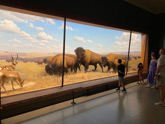
Two pictures from the American Museum of Natural History: one from the new Invisible Worlds exhibit, one compelling traditional exhibit. If you check out Invisible Worlds, be sure to pay attention to how the little kids interact with the pressure-sensitive floor. You can pay attention to the Serious Content For Grownups on the second loop.

Children and adults engaging with projected video no the walls and floor at the Invisible Worlds exhibit at the American Museum of Natural History in New York City. The kids are paying close attention to the floor, which is pressure-sensitive. The adults are more focused on the walls.
The bison exhibit at the American Museum of Natural History in New York. The buffalo are full size, probably actual stuffed individuals, on a beautiful matte painting backdrop as is common for these traditional exhibits.
MORE
8/7 '23 1 Comment
Woo hoo for bug fixes!!


Your recommendations for how to tour museums with kid-interactive installations is spot on—play first!
 
Stone walls held up by pillars on an uncertain, wet surface. Blurry image of our tour guide in foreground.

100 feet down in a former copper mine. Which is also a former prison. The past is a terrible place, never go there. Old Newgate Prison is worth a visit, though. The curation of the place... nowadays... has tipped heavily in the direction of rethinking incarceration. Also: nice vein of malachite in there.

Speaking of the past, thanks to U. and L. for bringing some nasty bugs to my attention. These bugs affected the process of accepting an invitation. Most were blatant, which is not so bad, because it was easy for L. to spot them and for me to fix them.

But the last one makes me kick myself: for *coughs* some time now, when accepting an invite, the dialog box giving you a chance to give a "friends" key to the person who invited you just didn't work properly. This is fixed, and will hopefully make it just that little bit easier for newcomers to communicate with the person who invited them in the first place.

Thankfully there was no issue in the opposite direction.

MORE
7/26 '23 2 Comments
You are the bestest. Thank you so much for building and maintaining this community.
I second Ursula's comments!<br />

<br />

<br />

<br />

That's a great pic that also shows weathering rinds emanating from the fractures in the rock, as groundwater followed those pathways and seeped into it. Malachite is such a beautiful mineral. I hate to think how much was destroyed as ore or for pigment, but this looks like it's not highly aesthetic mineralization.<br />

<br />

<br />

<br />

It sounds like an interesting place with some awful history. I really must get there!


I see that there are virtual tours: https://portal.ct.gov/DECD/Content/Historic-Preservation/04_State_Museums/Old-Newgate-Prison-and-Copper-Mine/Virtual-Tours
 

Is OnePo fully accessible? Um... yeah almost certainly not, because I haven't had it tested rigorously for that, nor have I consulted anyone with a disability about their actual experiences. Those steps would be good to take.

One bit of accessibility progress though: alternative text for images.

Adding an alt text field for images in posts was easy-peasy. Adding this to images in comments was an absolute bear, because of the lil' shortcut pattern I had before: tapping the image button on a comment immediately prompted you for an image file, and then immediately uploaded it, and you were done!

This was a nice pattern in a lot of ways, very light and breezy, but also totally brittle: the moment you wanted to add alt text it didn't work for us at all.

So I reworked the image comment editor, and now there is an alt text field beneath an "Upload Image" button, all proper-like.

There's another win today though: image uploads should be considerably faster, especially over slow links, and especially when the original file is large. That's because images are now resized on your device before they are uploaded.

It's true that this puts a slightly greater burden on the local device, but in practice it's a device every web browser has been ferociously optimized to handle, and most likely handles in dedicated hardware. That's because every website is crammed to the gills with images that don't precisely match the size of your screen. So asking your device to do this is reasonable, and it significantly reduces the workload for the server.

"Uh... yeah Tom, that workload must be awful with somebody posting once every hour or so!" Yeah, true, but I still get to learn useful things about doing this kind of stuff at scale, even if scale hasn't really happened here.

Anyway, here's Wonderwall. Photo-comment away, and let me know if anything breaks!

P.S. Hovering the mouse etc. will not display the "alt text." That's because it is truly set up as alternative text (e.g. the "alt" attribute) for accessibility purposes, and regular browsers intentionally don't display it by default. That "text on hover" thing you may be thinking of is the "title" attribute, and describing an image effectively for those who can't see it isn't really the same use case.

MORE
7/16 '23 12 Comments
Congrats on another significant achievement for the site! Looking forward to playing with these. :)


(Also - that new profile pic is killing me! 😁)
Interesting: This appeared to break. I added the image and alt text, then clicked on the 'comment' link (to post) and nothing changed.


Refreshed the page, and it appears to have functioned normally - just not informed me that it worked.


In case it matters - Chrome v 114.0.5735.199 on Windowz 10 Enterprise
Oops, I got tired and forgot to test animated GIFs. I’ll see what happens with that. Do you have better luck with something other than an animated GIF?
Huh, I couldn't get this to fail when I reposted your GIF. I guess we'll keep an eye on it.
I'm working on an expense report currently, and the hotel wifi is... suboptimal. That might have been the cause.
I probably don't have a busy indicator where I need one.
Optimally speaking, what browser is the best to use with OnePoWo?


I use Safari on my phone, Chrome on desktop for "work stuff" and Safari for OPW, but I'm willing to change.
Don’t change! The more data I have on what works and what doesn’t the better. If it’s broken on anything, it’s a bug I want to fix. This is not to say that anyone should keep using a phone so old that there are no security updates, or Internet explorer 11, or go out of their way to turn off the very important automatic updates of your browser, etc.
I run a home grown app for my work that had to be blind-accessible and FWIW, I was astonished how thoroughly just making consistent use of alt text any time there's a button or an image took care of the issues. You may actually not need to do much else.
Thanks. I was hoping that, but of course I would hope that.
 

I made some improvements to OnePo this week. Specifically:

  • I brought back the ability to insert more text, image and video blocks in between existing blocks in your post. Personally I found it too crazymaking to always add things at the bottom and then nudge them up.
  • However, there were user experience concerns expressed about that being too much before. This is why I took a stab at a better experience for it: the buttons to add new blocks are nestled in a single "+" toggle above each existing block, and you can toggle it closed again.
  • Speaking of nudging things up from the bottom, that was not a great experience either, particularly if you had to nudge something with the arrows ten times. So now we drag blocks around instead.

These changes work well on desktop, should also work well on tablets (let me know if you get the chance to try it), and work okay on mobile. I do find the new experience of dragging an image a little weird on the iPhone, but it works and hopefully I can continue to fine-tune it.

However... these changes are a bit selfish. There's nothing wrong, obviously, with putting my own uncompensated free time into features I like. Honestly! The nerve of this guy!

But, I've also promised alt text for images and that's a matter of accessibility. So I will get back to that next.

Alt text will be easiest to add for images in posts, because those are full-blown blocks in the editor. Adding one more editable field to them is no big deal.

But for images in comments, it's necessary to rethink the user experience. Right now it's a bit of a hack: "just pick an image and it'll upload and bam your comment is live!" That's cute, but it closes the door on adding alt text before your comment is live. And also there is currently no way to edit an existing image comment. So yeah, rethink.

I did carry out some interesting experiments in that area recently, which also included improvements to the image uploading experience. If I manage to carry that through, image uploads will be a lot faster because the browser will be doing the initial resizing work if necessary.

MORE
6/15 '23 39 Comments
It’s interesting how what makes you happy about OPW is and adding features is also things which are generally good. You’re not like other people who say, “IT WORKS it performs as advertised YAY now how do we use this for data mining and charge people $120 a month for it?”
This is why we love it here. Because we trust Tom to be the caretaker of our stories.
Tom has been a builder and a respectful steward of Community for as long as I've known him. Which... is a WHILE.
I met Tom in my freshman year of college. He was a junior. How did you two meet?
I’ve been wondering the same thing but didn’t know how to ask politely. I assumed it was talk.bizarre.
Annie and I met through talk.bizarre, so about the same time I met you IRL, and I once visited Casa Canetoad just after college. Also saw each other at an in person talk.bizarre BOB. I was gaffe central back then, but a few years on I set up Nerdsholm and did a respectable job of that whole stewarding thing for a number of years. Still remember Annie’s incarnation as Slim the Cowboy with fondness.
It's funny - I never experienced talk.bizarre, but I know enough folks that were part of it that it feels like it's a part of my own history. Kinda mind wobbly, that.
(For anyone who didn't experience Nerdsholm: it was basically an online chat server, although nominally a shared text adventure-y kind of space, as many were at the time. A large cohort of us were logged into it pretty much continuously and shared quite a bit of our lives. There was a wedding!)
That’s awesome.

My buddy Wes briefly set up an installation of his own custom MUD for some of us to use as a chat server. Not the same, but fun.
I have fond memories.
Annie is kind. I was quite a doofus when we met. But I grew into a respectfully stewarding doofus.
Tom is far more modest than I am kind.
Both can be true. In fact, I'll just say both are true - Tom is very modest, you are very kind.
I yield to your superior wisdom!
Tom is very modest, Anne is very kind, and Shell is very wise!
Yeah I’m way more modest than - damn.
That was much faster and easier than usual.
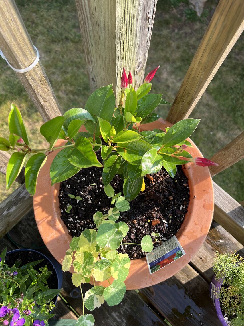
Actually it’s a mandevilla and some nasturtiums, but yes, the upload went more smoothly.
I didn’t do anything about the upload yet actually. That’s all in the experiment column right now.
Come in, I was giving you credit!
Sometimes I forget how big your brain is. Tis a thing of wonder.

I read your words about “user experience” and… it would never occur to me that these things needed “fixing.” Every day I’m merely grateful for this gift you provide and how it unfolds again and again, every day, in front of me.
She said it better than I did.
Yup. That exactly. Thank you!
I'm just happy he uses it for the Forces of Good. 😉
>Speaking of nudging things up from the bottom

How about a little French thing that hasn’t been fed in 9 or 12 weeks nudging things up from the bottom, Chris?
Hey, how do I turn the email reminder back on?
"Me" -> "Account" -> "Daily Email" checkbox
Thanks. As a low priority task, could you date stamp and separate the notifications? Maybe date stamp replies as well, although I enjoy the clean aesthetic.
and can you put a 3/4" layer of cream cheese frosting on top? Must be made with real Philadelphia cream cheese.
With a cherry too, please.
You won't get it if you've cleared your notifications by looking at them on the web.
Hmmm. I do both. I get the email, but I also do a 'detailed' look using the notifications on the web.

I mean, I _want_ both, but I'm wondering if there's a risk I will accidentally turn something off now.
You won’t turn anything off. It just won’t send what you have already read.
 

I fixed a bug. Turns out "delete comment" didn't work, for some unspecified amount of time, but probably since early this year. It failed in a very obvious way though, so I doubt anyone was misled into thinking they had removed a comment. All tidied up, sorry about that. Thanks to the person who reported it.

I also modernized a few boring technical details while I was in the neighborhood.

Every now and then I remember my new machine has a touchscreen. Then I try to forget. I'll never clean it.

MORE
5/6 '23 1 Comment
Memento mori.

Love, love, love.
 

No more goldang inexplicable sidey-scrolling on yer phonez goldangit!!

What was it, you ask?

Why, it was the fleuron, of course. The fleuron with the negative margins.

He wants a fleuron

With negative margins [doop dweet doooo]

Because he knows there's no such thing

MORE
2/10 '23
 

Fixed:

  • The "cancel" button for new, never-saved comments works reasonably now (broken for a long time).
  • Pasting a link to something well-annotated for social sharing, like a CNN article, now generates a nice "open graph" summary again. Also probably broken for some time super broken since ever in half a dozen ways, sorry. Debugged the daylights out of this.
  • Image comments (broken by the recent rewrite).
  • Layout issues on the iPhone, especially when open graph is in play.

Also, code quality things:

  • Removed yet more "dead code" (code no longer in use, exactly like junk DNA: if left in place too long there's a chance it'll be "in use" after all, in some sneaky and incomprehensible way).
  • Stopped using the obsolete "request" module to fetch stuff.

All in all, I'd say I got away with the rewrite pretty well. Nothing went hugely sideways. Twitching to do more with the site now, which is a nice feeling after slogging through / dreading the rewrite for so long.

Thanks to all who reported bugs.


Nice Open Graph example (CNN article).

Vastly more important Open Graph example (Mastodon #caturday post).

Looks like Mastodon's og:image tags have site-relative URLs. I noticed 'cuz I had a bug handling those. Amusingly, Facebook does not support relative URLs in open graph at all. This means I now have better support for Open Graph than Facebook. Phbbbbbt.

BTW Open Graph only "unfurls" if you paste a link straight into your text without clicking the link icon in the rich text editor. So if you don't want it, if you just want to type some text and then link it to something because this is the hyper-texter-webs goshdarnit, then type that text, select it and click the link button.

Open Graph still needs some styling love on mobile fixed that shizzle too.

MORE
2/5 '23 9 Comments
You're a wonder!
Maybe even a One Post Wonder.
Thank you, thank you, for making this community and keeping it good.
Came here to say this. :)
Seems I no longer get email notifications that my friends have been writing. Or I need to inspect my spam filters?
Those still go out. Check your spam?

They only go out if you haven’t been reading.
Didn’t they used to go out if people I follow post? I’m only getting them for replies to things _I_ post. Maybe I’m misremembering.
 

Hey, did you feel something? I hope not.

I've deployed a new version of the One Post Wonder source code. And it should be... exactly the same, for you. If not, please let me know.

For avoidance of confusion: if something seems busted, it's not you, it's me. Let me know. Thanks! I did lots of testing. But... software is hard.

Just in case, my email is tommybgoode@gmail.com. If stuff broke, tell me things ASAP. Thanks!

What Changed

"So... if everything is the same... what's different?"

I rewrote the code using a modern idiom that other programmers will be able to follow. Which makes it more practical for others to help me move OPW forward. It's a hell of a lot easier for me to maintain the code as well.

You see, back in the Bad Old Days, Node.js programming was like this:

"Hey Jane, fetch me some blog posts, then call me." [Hand-sign of phone]

"Hey Jack, when Jane calls me, fetch some comments, then call me." [Hand-sign of phone]

"Hey Joe, when Jack calls me after Jane calls me, fetch some images, then call me." [Hand-sign of phone]

Except dozens of requests are coming in at once so it's like a telethon in there with only one person manning the phones and everybody wants a fucking tote bag and theoretically that's OK because you don't actually speak continuously to one person right, so...

AAAAAAAA yeah complete madness.

In the New Idiom, Node.js JavaScript programming is like this:

MOTHER MAY I fetch some blog posts.

MOTHER MAY I fetch some comments.

MOTHER MAY I fetch some images.

Behind the scenes, it's the same telethon, but the management of all that parallel madness is encapsulated in the magic words "MOTHER MAY I," which allow us to express what we need to do as a simple series of steps and let JavaScript sort it out behind the scenes.

An astute observer will note that I still have to say "MOTHER MAY I" before each thing. I can't just do the fucking things. Which is still weird and unintuitive. However, in modern JavaScript "MOTHER MAY I" is expressed in the single word "await," which is at least convenient and readable. Crucially, it's at least readable by people who don't do this all day and who don't know this particular codebase by heart.

And the performance benefits are real enough that these days, Ruby, Python, PHP and even Rust optionally offer the same thing for those who need the speed.

So, we've got that going for us.

[Waves tattered flag]

Wait. Why do we do this?

A person might ask why programmers put up with any of this. Java and Python and Ruby and frickin' PHP all let you just write:

Do a thing

Do another thing

Do a third thing

THE END

So why would you put up with this "MOTHER MAY I" bullshit from JavaScript?

Well... because it's fast. Most languages for the web give you a separate thread, aka basically a completely separate telethon volunteer, to think about each request, aka person calling to get a tote bag. Which is enormously convenient. But, also slower because you're not maximizing the throughput of your telethon volunteers.

And... you have to write JavaScript for the browser anyway. To a first approximation, at least. So you may as well double down and use those skills on the server too, right? Less mental context switching. Which gives you plenty of energy for typing MOTHER MAY I! This is sane. [Nods firmly]

Um... great! What's next?

"So what's next?" New features? Probably new features. I promised alt attributes a LONG time ago.

Probably also breaking up that massive "routes.js" file into separate collections of API routes by topic, so I can find stuff.

Probably also TypeScript, just so I can put "8 billion years TypeScript experience" on my resume.

Thank you sir, may I please have another?

"What's TypeScript?" It's a new flavor of JavaScript that is "strongly typed." That means you have to say "MOTHER MAY I" even more often and in twisty new ways... but, if you fail to say it in exactly the same way when you try to call that same code later, it'll stop you and say "uh-uh, that's going to introduce a bug."

So it's a good thing.

One may well ask: does that mean TypeScript can check the original "MOTHER MAY I" incantations (aka "await" keywords) to make sure none are missing? That would be seriously useful.

Oh gosh no, it can't do THAT.  Who would want to catch by far the most common source of bugs in a Node.js program? No, it only stops you if you pass a string instead of a number (*), which I practically never do.

But I hear you can do it if you combine TypeScript and eslint and a roll of duct tape. So maybe I'll give that a try.

(*) Yes, yes, and a thousand more complicated but ultimately similar things.

MORE
2/2 '23 2 Comments
Test. Hi.
Looks like it works. Success!