 NaNoDrawMo - First Three
11/3 '14
NaNoDrawMo - First Three
11/3 '14
For any of you who haven't seen them elsewhere, here are the first three images that I've done NaNoDrawMo 2014:
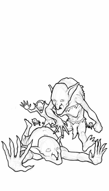
This first one is "Goblin Minion" the card allows you to play it along with another card. While each individual card is wimpy, this quickly allows you to build a formidible force. I kinda feel like that's a good, quick summary of my thoughts on Goblins, so this card is kinda the ultimate Goblin card imnsho.
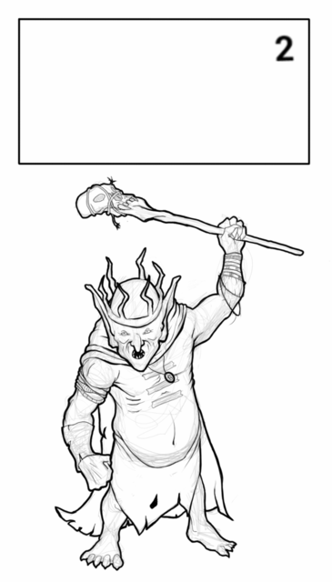
The Goblin King. No - there's no David Bowie here. Kinda a challenge because I wanted to make him more 'powerful' than the other goblin images, but he still needed to be... well, crappy. Worn clothing, and nothing of real value. The necklace was supposed to be a copper piece with a hole punched through it and worn as a medallion because of its great value. Don't really think that came across.
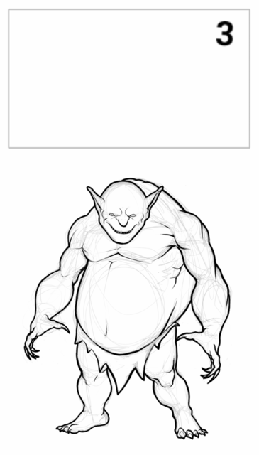
Big, dopey, and powerful, the Goblin Champion was fun to draw. I enjoyed tweaking his body shape and trying to maintain the biology of the standard goblin while distorting it enough to make this guy a 'champion'.