 Getting Rid of Dead Weight
7/5 '20
...the virtual kind.
So I've had DragonBones.Net since 20200928. After a blank page with just simple hypertext in the center which read 'dragonbone.net' and you had to click to enter, you came to a page which looked like this according to the WayBackMachine.org:
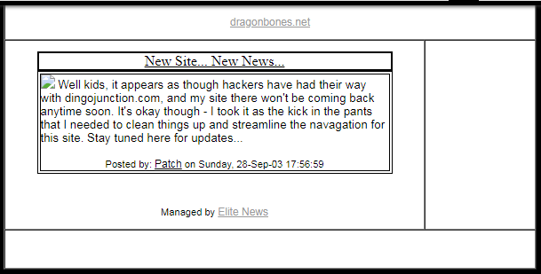
That seems about right, though I can't remember any reason for making you click on a link once you had arrived at the site in order to enter the site. It's not like it was a gateway guarded with a password or anything. If I remember correctly, the text was even grey on black, so it wasn't super easy to see.
I'm guessing I thought it was stylistically cool or something. Functionally annoying in hindsight, but hey - I was new to website building (more or less) and I probably stole the idea from other site I thought was cool at the time.
Those frames may have even been frames - remember those?! Maybe it was a table. Not concerned enough to really check.
Anyway, it wasn't too long until I added some more content, including some art, and (probably) an animated gif or seven of flaming torches in sconces because c'mon... DRAGONBONES.

Also, the size of that graphic demonstrates just how drastically the resolution of our monitors has changed over the years. That 'frame' pretty much filled my screen at the time.
Just a few short months later, and the WayBack has another capture. This one mid December of the same year, and I'd done some significant work on the site.
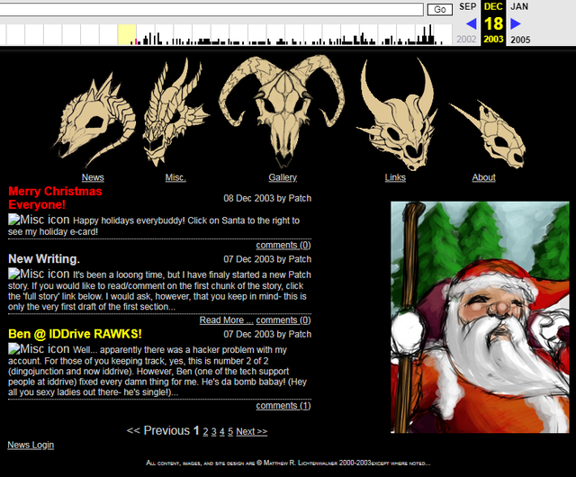
A lot more art, and that menu at the top was... *chef's kiss*. I mean, I was really proud of it. Why? Well...
- Each of those skulls was based on an actual dragon illustration from the current Monster Manuals for D&D with the exception of the center skull - one of my own design and still the site logo today. If I recall correctly, two were evil dragons and two were good - with 'my' dragon in the center. Don't think I ever told anyone that. It was just interesting symbolism for me to think about when I opened the site.
- Each skull was an animated GIF triggered by a mousover event. That took... a lot to the n00b that I was. I was using a pirated copy of Dreamweaver at the time to help me over the humps that I couldn't bash my way through when it came to code. I was completely ignorant of anything past rudimentary HTML, so that was a significant amount.
- The page displayed a default static image (as you see in the screen cap).
- Thanks to some 'onMouseOver' code from Dreamweaver, I figured out how to go from that static image to an animated GIF that went from that same static image to a shaded / rendered / sorta 3D version of the same skull at the same size with a color tint and highlighted text over the image which said where the link would take you (same as the labels under the graphics - just in case the graphics didn't show for any reason).
- The image would return to a static image once you moved the mouse away from the image. Each graphic only changed once, so it created a feel like 'you changed the icon' by mousing over it to something 'more real'.
- I remember getting the sizing just exactly right so there was no 'flexing' of the table it all sat in took me 4-ev-ah.
- How did I get the animated GIFs of each skull? Well, I used some kind of 'morphing software' which took one image and morphed it into something else. Usually, this was done with faces. Think of the tail end of Michael Jackson's "Black or White" video. (Side note: do yourself a favor and watch that if you haven't in a while.) Anyway - I did two versions of each skull - one 'flat' and one 'rendered' with a tint' and fed them into the software as 'start' and 'end'. If either image was off by a single pixel? It would 'flex' the table holding the menu. That took some time.
- I managed to crunch those menu graphics down small enough that the load time was... reasonable. Back then, that was FAR more worrisome than it is these days thanks to X baud modems.
And look at that news feed! If I remember correctly, that was an RSS feed from my LJ account. I think. It miiiight have even been for only 'public' posts which I treated as a new feed for my site so folks could get the info in either place.
Lastly, I have no idea when I actually started drawing digitally, but I was definitely doing so by this point. St. Nick there as well as the aforementioned menu items were all done digitally. In 2003. That feels a little like having a cell phone when most folks didn't have a wireless land line in their house.
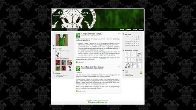
20080505 - It looks like I finally found out about this funky thing called 'WordPress' and switched over to GoDaddy.
In related news - holy hell with the dbn logo/crest. Calm down, dude. I'll say that it was a sign of the times and NOT my lack of good design skillz. For srsly.
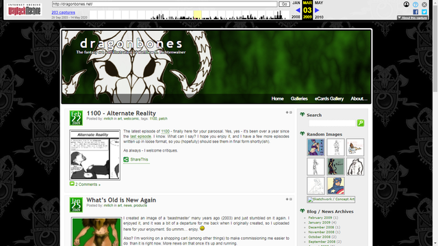
20090303 - Some changes to layout (though that's almost meaningless with WP) and mention of 1100. There was one previous episode, but this is the first instance that the WayBackMachine caught.
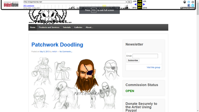
20130602 - Thanks to Jill "xtingu" Knapp 's better sense of style, this is the first appearance of the billyBoldHand font (in the logo). I like it so much that it's become a staple and gets used in most everything I do if I can manage it.
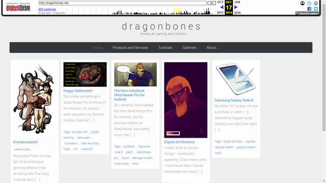
20141217 - Pinterest style 'brick' theme. While the site has undergone some minor changes since this point, it's more or less stayed like this - a 'brick' theme (like Pinterest) so that I can show off more art thumbnails directly on the front page. This seems the most sensible layout for the most part, so it's stuck for years.
So why am I telling you all this?
I'm thinking about pulling the plug on Ye Olde Bones of the Dragon as well as a number of other sites I own / host. It's doing nothing for me other than being a vanity site at this point.
No one gives one rat's ass that the site exists. They certainly don't go to it.
According to Google's Analytics for the last 9 months:
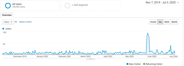
It seldom goes above single digits and they're almost entirely 'new visitors' which makes me think that most of those are web crawlers, bots, and the like.
The site's been taken over more than once, and I'm not even certain that it's 100% clean now (which would help to explain some of the low stats since the Almighty Google would likely not rank a 'dirty' site highly).
You've Made It This Far, So Here's the Honest Truth
I put a lot of hopes and dreams into this site, and it's gone no where in all these years.
The analogy that keeps popping into my head is the lame horse that you deeply love, and don't want to see suffer anymore.
Well That Escalated Quickly
Yup. I can't imagine that you've made it this far down my meandering along Memory Lane, so it's time to just get to the fucking monkey.
She won't die completely. I'll likely keep the url and point it to a subset of posts or a page on mrlich.com.
Hell, I'll probably do that with most (all?) of my other sites - rideoffintothesunset.com, libriexmachina.com, lightinthewoods.com, matt-works.com, etc.
Same reasons. No one gives a shit, and I'm spending... well, not a lot per year, but over time...
Have you somehow managed to make it all the way down here? Well shit, you must have some kind of opinion on the subject - please tell me. I'm all ears.
