 Helvetica? Really?!
10/20 '14
So the new OSX operating system version 10.10 shipped recently. They're calling it Yosemite. It makes a lot of things better/nicer/prettier. More in line with my sense of style.
Except the system font. (The system font is what "system" things are drawn with. Things like menu bars and buttons. Stuff you look at all the time.)
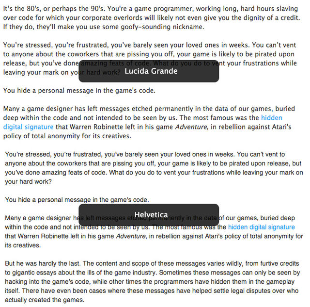
The system font in OSX used to be Lucida Grande. Now it's Helvetica Neue. That's bad.
Here's an image that shows the difference, courtesy of 64notes.com.

Helvetica is a regressive step for text like system captions because it's harder to read at small point sizes. It runs a little narrower in width for the same amount of text, which can be good for screen space conservation, but that is partly due to the things that make the font harder to read. And I think we can agree that harder to read is a bad direction to go for any important typeface.
Here's a list of things wrong with Helvetica, as compared to other typefaces in its genre, that make it a poor choice for a utility font.
1. The x-height is short. X height is a measurement of the height of the x character, and is a shorthand metric for the overall height of lowercase characters. In general, the taller the lowercase characters are in proportion to uppercase characters, the easier a font is to read at small sizes. (Yes, there is a point where this effect reverses itself.) Small type sizes call for a proportionally larger X height. (Admittedly, Lucida Grande's x-height is slightly shorter than Helvetica's. I never said it was perfect, only that it was overall, better.)
2. The bowls are enlarged and almost circular. The bowls are parts of the letterform that need to be distinctly round; letter with bowls are a, c, o, p, d, b and so on. Big, round bowls take up more space and, with their large interiors, tend to make text look uneven. Some roundness is needed, but an exaggerated, almost circular roundness is a specific stylistic choice. Small type sizes call for a more oval bowl shape to allow balanced density.
3. The kerning is too tight. This is where Helvetica gains space efficiency, by jamming characters together. By and large, the tight kerning is a response to the big round bowls. With all that whitespace within the characters, the only way to optically balance a line of text is to push characters closer together, visually augmenting their black lines. Tight kerning is particularly dangerous at small sizes, when characters can appear to run into each other. Bad kerning leading to character collisions is amusingly called keming for this very reason. Small type sizes call for a modestly kerned font.
4. The characters are too closed. The degree of open-ness of a typeface is represented by how much whitespace there is between disjoint features of the character. A simple measure of this is how much space there is between the two endpoints on the letter c, or between the upswing on the lowercase e and the crossbar, or between the two ends of the s and the middle sweep. A tightly closed typeface like Helvetica is harder to read at small sizes because the whitespace that should flow through the letterforms is more closed off. Small type sizes call for a moderately open font.
Helvetica is not a bad font. It's fine at large sizes, especially when used in moderation.
But it's a bad choice for a computer system font where readability at small point sizes is critical, and I think Apple has made a real mistake here.
Unfortunately, I think we're stuck with it. Apple's made a huge deal about the typography in iOS7 (where we first saw Helvetica used as a system font) and iOS8, and now it's all over OSX in Mavericks. Crap.
Here's an interesting thing, though. You'd think if Apple was really in love with Helvetica, they'd use it all over their website, too. After all, the website is the first impression any company makes on a new customer. But, they don't use Helvetica there at all: Apple.com's CSS font-family specifier is "Myriad Set Pro", "Lucida Grande", "Helvetica Neue" , ... in exactly that order. Which, interestingly, is about the order in which I'd like to see those fonts used.
I guess the folks behind the website still have some independence. I wonder how long it will be until Jony Ive whips them into conformance.

How long can I not do that?